Category Archives: Showing Data

The Presentation Boss Podcast

I recently discovered a fantastic podcast on speaking and presentation from down under called The Presentation Podcast, hosted by Thomas Krafft and Kate Norris.

In a unique approach, they rotate weekly among three different formats: An interview with a figure in the presentation or speech world, a speech breakdown in which they play a speech by a public figure and critique it, and an topic episode in which they cover a particular aspect of presentation.

I was on this week’s installment, Episode #64. Check it out here!

FacebooktwitterlinkedinFacebooktwitterlinkedin

Investing in Our Presentation Design Business: The Presentation Podcast Episode #93

The Presentation Podcast


Episode #93, Investing in Our Presentation Design Business is up!

Troy, Sandy and I kick the new year off with a discussion on just where we put our money to invest in our presentation businesses—everything from what’s physically in our offices to software and subscriptions.

Take a listen!

Subscribe on iTunes and check out the show notes for more info.

FacebooktwitterlinkedinFacebooktwitterlinkedin

When Scientists Present (Conversation w/ Mike Morrison): The Presentation Podcast Episode #87

The Presentation Podcast


Episode #87, When Scientists Present (Conversation w/ Mike Morrison) is up.

Troy, Sandy and I welcome Mike Morrison, someone who has been making some waves in the world of scientific presentation with his proposals for better and differently designed science posters.

We have a wide ranging talk about how scientists present, how they can present better and why graphic design might be the key to curing cancer—well, kind of. But you’ll have to listen to hear more about that.

Take a listen!

Subscribe on iTunes and check out the show notes for more info.

FacebooktwitterlinkedinFacebooktwitterlinkedin

How to Use PowerPoint Chart Templates to Speed Up Formatting Your Data

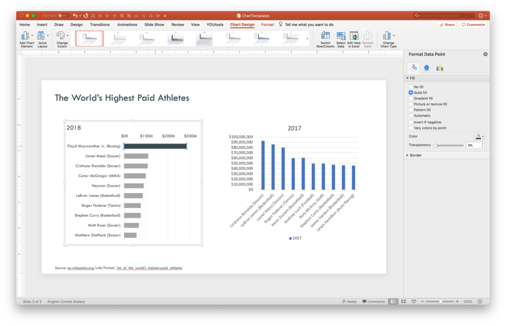
PowerPoint’s Format Painter can save you endless hours with shapes and text boxes, but it doesn’t work on charts. There is, however, a method to save and paste design formatting from one chart to another. So, let’s dive into the mysterious world of Chart Templates and .crtx files.

We’ll start with data sets for the highest paid athletes in 2018 and 2017 and a default chart style (click the images below for a closer look)…

Continue reading the entire article over at CreativePro.com.

And don’t forget, I’ll be speaking at CreativePro’s CreativeProWeek Click Presentation Conference in June in Seattle! (Discounted registration available until April 15!)


FacebooktwitterlinkedinFacebooktwitterlinkedin

The Data Visualization Sketchbook

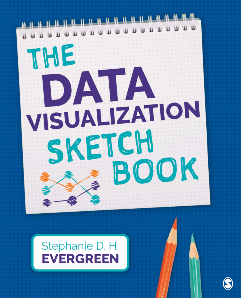
Stephanie Evergreen will soon be out with another book for the data visualization community (to coincide with the second edition of her phenomenal first book Effective Data Visualization). This one is called The Data Visualization Sketchbook, and in it Stephanie gives readers multiple templates for use in assembling data reports, handouts, dashboards, presentations and more.

The templates and overall approach are a nice reminder that diving into Tableau or Word or PowerPoint is not always the best or most efficient course of action. Sometimes getting pencil and paper out helps organize your data and information and simplify your message.

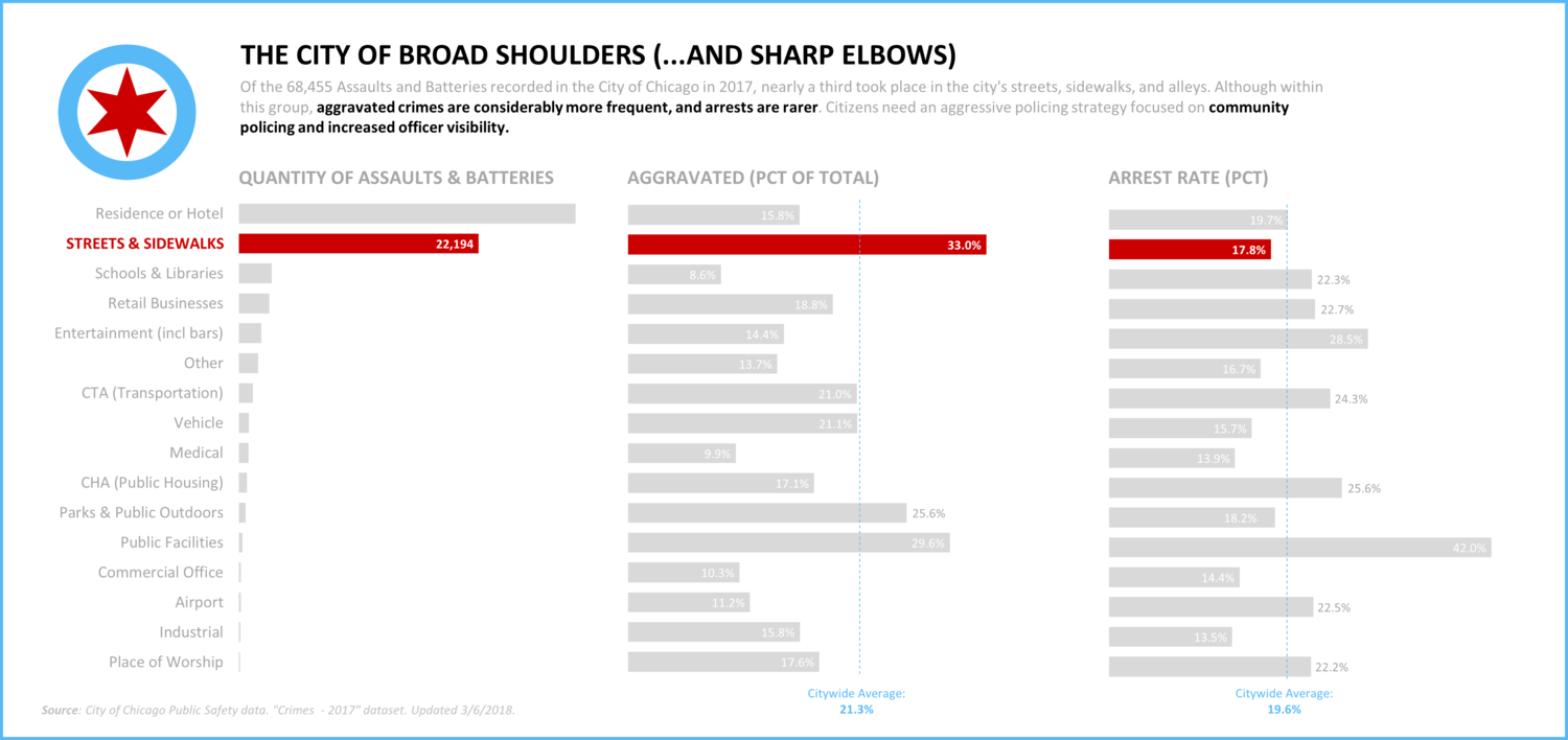
Below are a couple of Stephanie’s templates I used to prep for an upcoming data report project.

Take a look and also take a look at Stephanie’s site for tons of great info on visualizing data.


FacebooktwitterlinkedinFacebooktwitterlinkedin

The Visual Storytelling of Factfulness

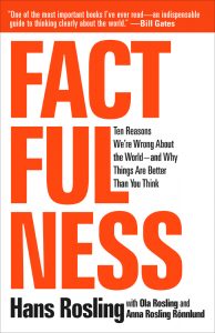
Factfulness by Hans Rosling is significant attention as well it should be. Of course, Bill Gates saying it is “one of the most important books” he’s ever read doesn’t hurt.

Like any reader, I imagine, I had my eyes opened continually about misconceptions about the world–which is the intent of the book. But, I’ll always remember Hans Rosling not only for what he said, but how he said it. His TED Talks are famous for his energy, but also for the demos of his Gapminder software that animates bubble charts. Rosling was able to visualize data in such an accessible way, and I wanted to point out two of my favorite examples of how he implemented visual storytelling in Factfulness.

The Chimpanzee

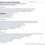
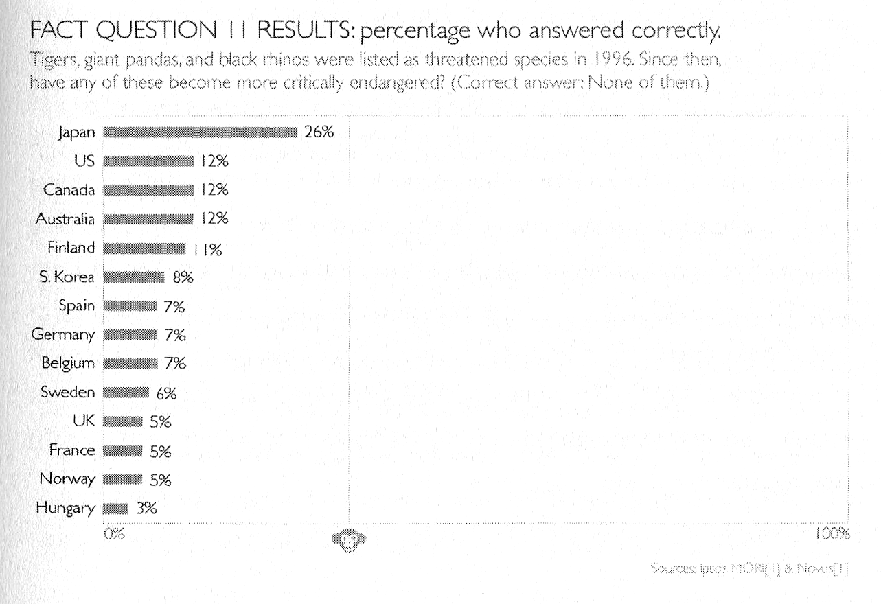
The book is premised on the survey results to a series of questions that Rolling asked audiences all over the world. Predictably, no matter what their education or background, people fundamentally have misperceptions about the world and facts. Each question only has three possible answers, and he makes the point over and over that even a chimpanzee answering the quiz will get on average 33% correct answers. But as we see, even the most educated audiences often score lower than a random guess because of bias. And so, Rosling will add in on the x-axis a “Chimp Point” showing were random correct responses should lie. Here’s an example.
The Picture Superiority Effect in Action

Much of the book revolves around the four income levels as defined by the World Bank which breaks down essentially as:

Level 1: $1/day
Level 2: $4/day
Level 3: $16/day
Level 4: $64/day

You could chart or describe with words these four levels in a million different ways, but Rosling breaks it down to the simplest explanation with pictures of what it means at different levels to
sleep or eat or brush your teeth. Here’s a grid showing just what it means…

It’s a good and fast read, and I definitely recommend it.

And if you want to make animated bubble charts a la Rosling, you can do so in PowerPoint with this hack.

FacebooktwitterlinkedinFacebooktwitterlinkedin

A Wealth of Bar Charts

Storytelling with Data has a nice collection this month of bar charts in every shape and size.

FacebooktwitterlinkedinFacebooktwitterlinkedin

I’m Giving Away Free Data Viz Makeovers

Have a deck full of awful, tired pie charts that aren’t cutting it?  Embarrassed by your monthly sales dashboard? Can’t get your boss to spring for a professional makeover of your signature SEO results?

Here’s the deal

I train organizations all over the country on how to better communicate their data and create effective data visualizations. And for a short period, I am providing completely free makeovers of existing charts for you and your organization.

Here’s the catch

I’m making this offer to obtain new real-world examples of data sets and visualizations for use in my trainings. So, in exchange for my design work, you agree to allow me the use of the data and makeovers however I choose.

“But my data is sensitive and proprietary!” No problem. I’m happy to:

  • Sign any required NDAs.
  • After delivering your makeover, scrub charts of identifying data, logos, color and information resulting in a “generic” version for which you will grant final written approval for me to use.

Note: You must be capable of providing such final approval for your organization…

What else?

  • I’ll look at any data and existing charts, but am most interested in those related to marketing, media, advertising, digital research, sales and any work by agencies.
  • I’m looking for challenges and diversity of information, so I probably won’t be interested in making over 100 identical column charts of monthly sales.
  • My focus is on simplicity of messaging and charts that the average user can create using typical tools; if you’re looking for interactive “data art,” that’s not me.
  • I reserve the right to decline any project or portion of project for any reason.
  • I do need to work around paying projects and trainings, but won’t leave you hanging forever.

Contact me at nolan@nolanhaimscreative.com, and feel free to forward this offer on to anyone else you know. First come, first served!


FacebooktwitterlinkedinFacebooktwitterlinkedin
Categories: Showing Data.
visual training presentation