Category Archives: Visual Thinking

PowerPoint’s new Insert Stock Images

PowerPoint has a new and long asked for feature up its sleeve that could save you a ton of money if you’re in the market for stock imagery. Until just recently, there were only two ways you could insert high quality stock imagery from within PowerPoint:

1) Insert Online Pictures performs a Bing Image Search for you. But as we’re all aware, that’s the Wild West, and while you might find a decent Creative Commons image (the default search criteria which can be changed), the quality is limited, and who knows if it’s actually Creative Commons.

2) Office Add-ins such as those for Pickit, Pexels, AdobeStock and Shutterstock, allow you to search and insert imagery from 3rd party sites, but often these require paid accounts.

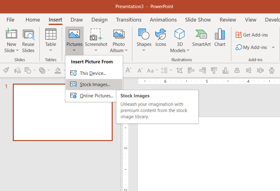
But now, under the same Insert menu where you have Online Pictures, you’ll notice an option for Stock Images.

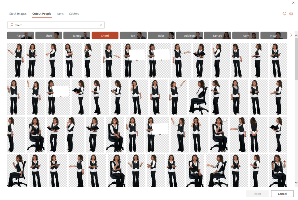
This brings up a new window with four categories: Stock Images, Cutout People, Icons and Stickers. Icons is simply the icon collections we have had for a while, but the other three categories are new and curated by Microsoft. Stickers is cute, but might have limited usage in a business context. Cutout People is a collection of transparent poses categorized by the model themselves, so you can get 50 shots of the same model to use throughout a presentation.

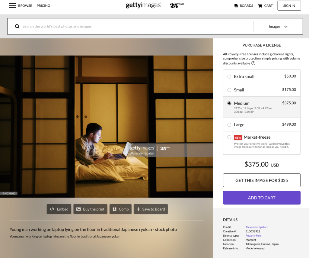
The real prize though is in Stock Images, where you can search and insert high quality professional stock imagery from places like Getty and iStock, and as long as you use them within the context of Microsoft Office (the feature is available in all Microsoft 365 applications), there is no cost to you. Microsoft doesn’t tag the images with their origin, but a little reverse image searching reveals that you can use a particular image without cost OR if you’re so inclined, you could go to Getty and pay a lot. For example, searching “Laptop Japan Man” in PowerPoint returns the images below. You can use that cool shot in the second row for free in your presentation (provided you’re a Microsoft 365 subscriber)…

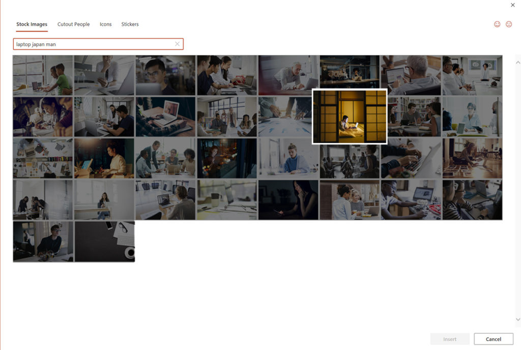
..or I suppose you could also go to Getty Images and pay upwards of $500 for it.

There are a few caveats here—mainly that you can’t extract Office’s stock images for use outside of Microsoft Office. So, while you can use them in presentations all you want, you can’t use them on your website or in a marketing brochure—unless you design the marketing brochure in PowerPoint or Word, I suppose. Also, the feature is currently not available on the Mac. Anyway, we’ve come a long way from ClipArt!

FacebooktwitterlinkedinFacebooktwitterlinkedin

Investing in Our Presentation Design Business: The Presentation Podcast Episode #93

The Presentation Podcast


Episode #93, Investing in Our Presentation Design Business is up!

Troy, Sandy and I kick the new year off with a discussion on just where we put our money to invest in our presentation businesses—everything from what’s physically in our offices to software and subscriptions.

Take a listen!

Subscribe on iTunes and check out the show notes for more info.

FacebooktwitterlinkedinFacebooktwitterlinkedin

When Scientists Present (Conversation w/ Mike Morrison): The Presentation Podcast Episode #87

The Presentation Podcast


Episode #87, When Scientists Present (Conversation w/ Mike Morrison) is up.

Troy, Sandy and I welcome Mike Morrison, someone who has been making some waves in the world of scientific presentation with his proposals for better and differently designed science posters.

We have a wide ranging talk about how scientists present, how they can present better and why graphic design might be the key to curing cancer—well, kind of. But you’ll have to listen to hear more about that.

Take a listen!

Subscribe on iTunes and check out the show notes for more info.

FacebooktwitterlinkedinFacebooktwitterlinkedin

The Data Visualization Sketchbook

Stephanie Evergreen will soon be out with another book for the data visualization community (to coincide with the second edition of her phenomenal first book Effective Data Visualization). This one is called The Data Visualization Sketchbook, and in it Stephanie gives readers multiple templates for use in assembling data reports, handouts, dashboards, presentations and more.

The templates and overall approach are a nice reminder that diving into Tableau or Word or PowerPoint is not always the best or most efficient course of action. Sometimes getting pencil and paper out helps organize your data and information and simplify your message.

Below are a couple of Stephanie’s templates I used to prep for an upcoming data report project.

Take a look and also take a look at Stephanie’s site for tons of great info on visualizing data.


FacebooktwitterlinkedinFacebooktwitterlinkedin

CreativeProWeek: Click – A Conference for Presentation Designers

CreativeProWeek is the country’s premiere “how-to” conference for design professionals. Their unique format divides the week into various subject areas including InDesign, Photoshop, Illustrator and more. And last year for the first time, the conference added two days focused on presentation design – that all-too-important topic that doesn’t always get much love from the more traditional worlds of print and graphic design.

This year, CreativeProWeek is again offering two days of intensive focus on presentation design in their conference within a conference called Click. And I will be speaking in Seattle the week of June 10th along with some other industry pros including Julie Terberg and Richard Goring.

I will be giving sessions on Alternatives to Bullet Points and Visualizing Data for Presentation.

If you are professional presentation designer or if you’re a graphic designer who often gets frustrated when called upon to design presentations, this is the conference for you. Come for just the Clickportion or come for more. Personally, I’ll be there all week eagerly soaking up the InDesign and Photoshop sessions. There’s always more to learn!

And if you are thinking of going, definitely register by April 15th when the early bird discount expires.

Take a look at the full conference agenda, list of expert speakers, and register now at CreativeProWeek.com.

Please don’t hesitate to reach out with any questions on this (or anything else, of course) if you have them!

FacebooktwitterlinkedinFacebooktwitterlinkedin

Presentations in the Courtroom: The Presentation Podcast Episode #70

The Presentation Podcast


Episode #70, Presentations in the Courtroom with Kerri L. Ruttenberg is up and live!

Troy, Sandy and I welcome our first legal guest, Kerri L. Ruttenberg, to talk about trial graphics, how presentation is used in the courtroom and her fantastic book, Images with Impact: Design and Use of Winning Trial Visuals.

Kerri is a top DC litigation attorney and probably the top expert in using visuals in the courtroom in the country. I reviewed her book a while back when I first learned of it, but now we get to dive a bit deeper and hear more about the psychology of visuals, what can and can’t be used in a courtroom and what the state of the trial graphics industry is.

Even if you never plan on working in this area of presentation design, this is a really good conversation in which you’ll learn a ton not just about how to convince juries with visuals, but how to convince your own audiences.

Take a listen!

Subscribe on iTunes and check out the show notes for more info.

FacebooktwitterlinkedinFacebooktwitterlinkedin

Create Your Own Infographics with Build-a-Graphic

One of the questions I get asked most often is how can an average user create professional-looking infographics in PowerPoint. There are very good sites like Diagrammer, Canva and Infogram that can all help with providing and assembling elements of an infographic. And yes, you can always resort to PowerPoint’s own SmartArt, but unless you use it simply as a starting point, it’s going to look like…well, SmartArt. The disappointing truth is that to produce a professional looking infographic, you generally need to hire a professional. Enter Mike Parkinson and his brand new Build-a-Graphic add-in for PowerPoint.

Mike Parkinson runs Billion Dollar Graphics and is one of those professionals that has been creating custom infographics for high profile clients for years. He’s got an excellent book on infographics and a brand new one on PowerPoint, but he has also just introduced Build-a-Graphic, a killer add-in for PowerPoint that allows any user to call upon a massive library of pre-made (professionally designed!) vector graphics all from within PowerPoint. If SmartArt is a tricycle, Build-a-Graphic is a Ferrari.

But it gets even better. Because while you can simply search through the catalog of ready-to-use graphic and insert them onto your PowerPoint slides, the tool can also examine your slide’s content for you, automatically convert bullet points to more readable visual chunks and then suggest specific graphics relevant to your material. The quick demo below shows all this in action.

And all graphics are made up of pure PowerPoint shapes and vectors which means they are completely customizable, recolorable and can be taken apart however you like.

It’s not an exaggeration to say that now that anyone can have professionally designed customized graphics with just a few clicks of the mouse.

The Build-a-Graphic add-in is a $99/year subscription which includes ongoing updates and additions to the graphic catalog. PC only for right now.

FacebooktwitterlinkedinFacebooktwitterlinkedin

The Visual Storytelling of Factfulness

Factfulness by Hans Rosling is significant attention as well it should be. Of course, Bill Gates saying it is “one of the most important books” he’s ever read doesn’t hurt.

Like any reader, I imagine, I had my eyes opened continually about misconceptions about the world–which is the intent of the book. But, I’ll always remember Hans Rosling not only for what he said, but how he said it. His TED Talks are famous for his energy, but also for the demos of his Gapminder software that animates bubble charts. Rosling was able to visualize data in such an accessible way, and I wanted to point out two of my favorite examples of how he implemented visual storytelling in Factfulness.

The Chimpanzee

The book is premised on the survey results to a series of questions that Rolling asked audiences all over the world. Predictably, no matter what their education or background, people fundamentally have misperceptions about the world and facts. Each question only has three possible answers, and he makes the point over and over that even a chimpanzee answering the quiz will get on average 33% correct answers. But as we see, even the most educated audiences often score lower than a random guess because of bias. And so, Rosling will add in on the x-axis a “Chimp Point” showing were random correct responses should lie. Here’s an example.

The Picture Superiority Effect in Action

Much of the book revolves around the four income levels as defined by the World Bank which breaks down essentially as:

Level 1: $1/day
Level 2: $4/day
Level 3: $16/day
Level 4: $64/day

You could chart or describe with words these four levels in a million different ways, but Rosling breaks it down to the simplest explanation with pictures of what it means at different levels to
sleep or eat or brush your teeth. Here’s a grid showing just what it means…

It’s a good and fast read, and I definitely recommend it.

And if you want to make animated bubble charts a la Rosling, you can do so in PowerPoint with this hack.

FacebooktwitterlinkedinFacebooktwitterlinkedin
visual training presentation