Category Archives: Information Design

Let’s Hear It Podcast

The The Let’s Hear It! Podcast is covers the world of foundation and nonprofit communications, and I have known Eric Brown, one of the hosts for more years than I can count. So I was excited to be asked on as a guest to talk about effective presentation design with a particular bent towards the nonprofit world which I have been working in for as many years as I have known Eric.

It’s a great and funny conversation that has covering a lot including why you want to “make your content like a Twinkie.”

Take a listen!


FacebooktwitterlinkedinFacebooktwitterlinkedin

The Remote Communication Continuum

As we all communicate online more and more, I see some people nervous about “doing it right.”

While you should try for clear sound, well-lit video and a clean shirt, you don’t necessarily have to set your home office up like the evening news. I’ve been coalescing around the idea that there is a continuum of communications and a lot of gray areas even within the same software platform. And it’s okay to  slide along this continuum and ramp up your effort accordingly:


FacebooktwitterlinkedinFacebooktwitterlinkedin
Categories: Design, Information Design.

The Data Visualization Sketchbook

Stephanie Evergreen will soon be out with another book for the data visualization community (to coincide with the second edition of her phenomenal first book Effective Data Visualization). This one is called The Data Visualization Sketchbook, and in it Stephanie gives readers multiple templates for use in assembling data reports, handouts, dashboards, presentations and more.

The templates and overall approach are a nice reminder that diving into Tableau or Word or PowerPoint is not always the best or most efficient course of action. Sometimes getting pencil and paper out helps organize your data and information and simplify your message.

Below are a couple of Stephanie’s templates I used to prep for an upcoming data report project.

Take a look and also take a look at Stephanie’s site for tons of great info on visualizing data.


FacebooktwitterlinkedinFacebooktwitterlinkedin

Presentations in the Courtroom: The Presentation Podcast Episode #70

The Presentation Podcast


Episode #70, Presentations in the Courtroom with Kerri L. Ruttenberg is up and live!

Troy, Sandy and I welcome our first legal guest, Kerri L. Ruttenberg, to talk about trial graphics, how presentation is used in the courtroom and her fantastic book, Images with Impact: Design and Use of Winning Trial Visuals.

Kerri is a top DC litigation attorney and probably the top expert in using visuals in the courtroom in the country. I reviewed her book a while back when I first learned of it, but now we get to dive a bit deeper and hear more about the psychology of visuals, what can and can’t be used in a courtroom and what the state of the trial graphics industry is.

Even if you never plan on working in this area of presentation design, this is a really good conversation in which you’ll learn a ton not just about how to convince juries with visuals, but how to convince your own audiences.

Take a listen!

Subscribe on iTunes and check out the show notes for more info.

FacebooktwitterlinkedinFacebooktwitterlinkedin

Create Your Own Infographics with Build-a-Graphic

One of the questions I get asked most often is how can an average user create professional-looking infographics in PowerPoint. There are very good sites like Diagrammer, Canva and Infogram that can all help with providing and assembling elements of an infographic. And yes, you can always resort to PowerPoint’s own SmartArt, but unless you use it simply as a starting point, it’s going to look like…well, SmartArt. The disappointing truth is that to produce a professional looking infographic, you generally need to hire a professional. Enter Mike Parkinson and his brand new Build-a-Graphic add-in for PowerPoint.

Mike Parkinson runs Billion Dollar Graphics and is one of those professionals that has been creating custom infographics for high profile clients for years. He’s got an excellent book on infographics and a brand new one on PowerPoint, but he has also just introduced Build-a-Graphic, a killer add-in for PowerPoint that allows any user to call upon a massive library of pre-made (professionally designed!) vector graphics all from within PowerPoint. If SmartArt is a tricycle, Build-a-Graphic is a Ferrari.

But it gets even better. Because while you can simply search through the catalog of ready-to-use graphic and insert them onto your PowerPoint slides, the tool can also examine your slide’s content for you, automatically convert bullet points to more readable visual chunks and then suggest specific graphics relevant to your material. The quick demo below shows all this in action.

And all graphics are made up of pure PowerPoint shapes and vectors which means they are completely customizable, recolorable and can be taken apart however you like.

It’s not an exaggeration to say that now that anyone can have professionally designed customized graphics with just a few clicks of the mouse.

The Build-a-Graphic add-in is a $99/year subscription which includes ongoing updates and additions to the graphic catalog. PC only for right now.

FacebooktwitterlinkedinFacebooktwitterlinkedin

The Visual Storytelling of Factfulness

Factfulness by Hans Rosling is significant attention as well it should be. Of course, Bill Gates saying it is “one of the most important books” he’s ever read doesn’t hurt.

Like any reader, I imagine, I had my eyes opened continually about misconceptions about the world–which is the intent of the book. But, I’ll always remember Hans Rosling not only for what he said, but how he said it. His TED Talks are famous for his energy, but also for the demos of his Gapminder software that animates bubble charts. Rosling was able to visualize data in such an accessible way, and I wanted to point out two of my favorite examples of how he implemented visual storytelling in Factfulness.

The Chimpanzee

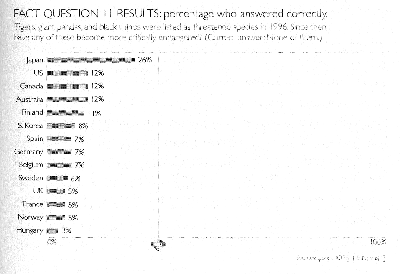
The book is premised on the survey results to a series of questions that Rolling asked audiences all over the world. Predictably, no matter what their education or background, people fundamentally have misperceptions about the world and facts. Each question only has three possible answers, and he makes the point over and over that even a chimpanzee answering the quiz will get on average 33% correct answers. But as we see, even the most educated audiences often score lower than a random guess because of bias. And so, Rosling will add in on the x-axis a “Chimp Point” showing were random correct responses should lie. Here’s an example.

The Picture Superiority Effect in Action

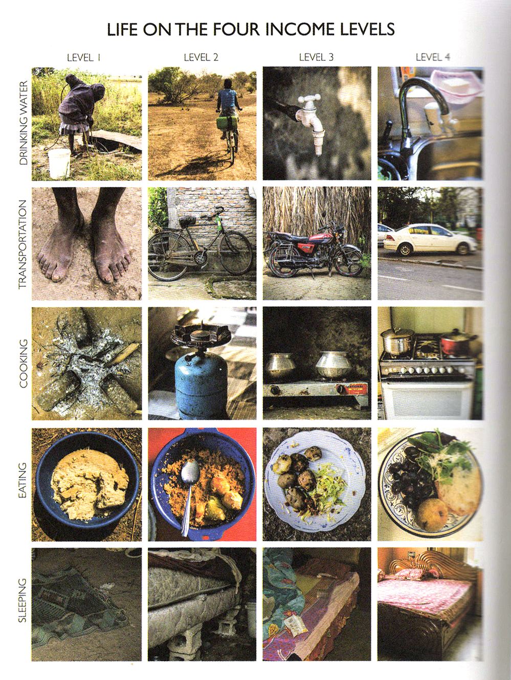
Much of the book revolves around the four income levels as defined by the World Bank which breaks down essentially as:

Level 1: $1/day
Level 2: $4/day
Level 3: $16/day
Level 4: $64/day

You could chart or describe with words these four levels in a million different ways, but Rosling breaks it down to the simplest explanation with pictures of what it means at different levels to
sleep or eat or brush your teeth. Here’s a grid showing just what it means…

It’s a good and fast read, and I definitely recommend it.

And if you want to make animated bubble charts a la Rosling, you can do so in PowerPoint with this hack.

FacebooktwitterlinkedinFacebooktwitterlinkedin

A Wealth of Bar Charts

Storytelling with Data has a nice collection this month of bar charts in every shape and size.

FacebooktwitterlinkedinFacebooktwitterlinkedin

Minard for Sale

Daniel Crouch Rare Books has a catalog of various data visualization offerings including a nice  collection of Minard works for a hefty £400,000. Some of the works I was unfamiliar with and yes, a copy of the Napoleon map is one of them. You can purchase the catalog from their site and download a PDF here.

FacebooktwitterlinkedinFacebooktwitterlinkedin
visual training presentation