Category Archives: Design

Keeping Logos on Top of PowerPoint Placeholders


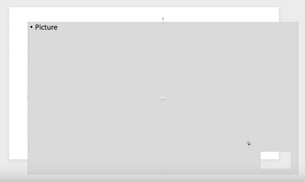
If you’re in the business of setting up PowerPoint templates and need a way to create a layout in which a logo or other content always floats on top of an image placeholder, these are two hacks that will do just that for you.

And one will also let you create an image placeholder in any shape you want—not just default circles and rectangles.

FacebooktwitterlinkedinFacebooktwitterlinkedin
Categories: Design, Imagery, PowerPoint.

Making Content Invisible in PowerPoint Slideshows

One of my favorite PowerPoint hacks is to hide page numbers in slideshow mode because really, who needs to see those on screen? This simple technique can also be used to hide unreadable source notes and any other content that should be visible in printouts and PDFs, but just isn’t needed or wanted on screen. Watch it here!

FacebooktwitterlinkedinFacebooktwitterlinkedin

Click: The Presentation Design Conference

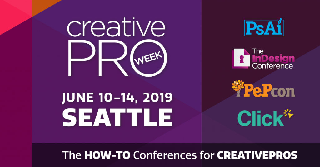
There’s a new(ish) conference dedicated to presentation out there, and I couldn’t be more excited to be a speaker at this year’s Click Presentation Design Conference, June 13-14 in Seattle.

Click is a part of Creative Pro Week, a larger gathering dedicated to Photoshop, InDesign, Illustrator and other aspects of print design, run by CreativePro. Traditionally, those hard core Adobe print and digital graphic designers didn’t pay a whole lot of attention to the world of presentation, so I was thrilled to see the organizers of Creative Pro Week add a couple of days dedicated to presentation design at last year’s conference in New Orleans. And apparently, it was a hit, so they are again offering attendees sessions dedicated to the world of slides.

I’ll be giving two sessions (topics to be announced soon) and will be joining a number of other heavyweights including Julie Terberg and Richard Goring of BrightCarbon.

The complete list of speakers and more information is here, and the full conference agenda will be announced shortly. But you can register now for 1, 2, 3, 4 or 5-day passes depending on how much learnin’ you want. I’m hoping to arrive a day or two prior to the start of Click in order to deepen my InDesign skills.

If you’ve been on the fence about attending the Presentation Summit because it might be too much presentation and not enough design, Creative Pro Week might be for you! Or if you just want to soak up as much presentation stuff as you can, I would definitely consider heading out to Seattle in June.

And if you do decide to go, let me know as I would love to meet you!

FacebooktwitterlinkedinFacebooktwitterlinkedin
Categories: Design, Presenting Live.

Presentations in the Courtroom: The Presentation Podcast Episode #70

The Presentation Podcast


Episode #70, Presentations in the Courtroom with Kerri L. Ruttenberg is up and live!

Troy, Sandy and I welcome our first legal guest, Kerri L. Ruttenberg, to talk about trial graphics, how presentation is used in the courtroom and her fantastic book, Images with Impact: Design and Use of Winning Trial Visuals.

Kerri is a top DC litigation attorney and probably the top expert in using visuals in the courtroom in the country. I reviewed her book a while back when I first learned of it, but now we get to dive a bit deeper and hear more about the psychology of visuals, what can and can’t be used in a courtroom and what the state of the trial graphics industry is.

Even if you never plan on working in this area of presentation design, this is a really good conversation in which you’ll learn a ton not just about how to convince juries with visuals, but how to convince your own audiences.

Take a listen!

Subscribe on iTunes and check out the show notes for more info.

FacebooktwitterlinkedinFacebooktwitterlinkedin
visual training presentation