
 My shelves overflow with books on presentation, graphic design and public speaking, but it has been years since I’ve added one to the collection that is so damn practical and hits the nail on the head over and over when it comes to creating effective presentations.
Kerri L. Ruttenberg is the author of the recently published Images With Impact: Design and Use of Winning Trial Visuals. Kerri is not a designer, but an accomplished trial lawyer who has carved out a niche in her world as an expert in using visual for trials. (Trial graphics is a niche itself in the niche world of presentation design, and an area I know nothing about.) Like so many of us, Kerri kind of fell into the world of presentation. And like many of us, she read and learned from the classic authors which she quotes often from: Nancy Duarte, Garr Reynolds, John Medina. The big difference with this book for me—and the reason why I so enjoyed reading it—is that she has taken all the conventional presentation design wisdom and synthesized it into a practical handbook with real-world examples in practice on nearly every page.
I have grown so weary over the years of reading about Gestalt theory where the author shows the grid of circles and says, “Use the principle of proximity on your slides to indicate relationships,” and moves on without showing examples of exactly how proximity can be used in slide design. Kerri steps in with a quick definition, but then gives a real-world example over two pages where moving an image of a signature closer to a contract clause communicates how the two are connected—the kind of thing you want your jury to clearly understand.
It’s all about the jury
And keeping a focus on the audience—in her world, that is the jury—is what Kerri does constantly throughout this book. Because this is a niche subject and the stakes in this world are so high, the book does more than most in driving home the importance of designing effective presentations for an audience and controlling the flow of information to that audience. As she says, “When I present slides…I control what the jurors see, when they see it, and how much time they have to absorb it.” If I were on trial, this is exactly what I would want my lawyer doing. No matter who your audience is, managing information flow is vital. The situation is made clearer when the audience is a murder trial jury, but even if it’s just an insurance conference audience, you should still build your bullet points so that audience doesn’t get ahead of you.
The book adds to the traditional audience studies (i.e.. Picture Superiority Effect, 3M) with those on juries. For example, apparently jurors immediately forget as much as 2/3 of the facts presented to them and studies show that visuals clearly help in the courtroom. Good trial lawyers also know that jurors tend to take more notes when there are fewer words on the screen.
Legal considerations
 I loved learning about Federal Rule of Evidence 403 which essentially means a photo can be excluded from evidence if it is unfairly prejudicial by being too emotional rather than factual. So, while lawyers need to tread carefully and not plaster a photo of the defendant with the words guilty pasted across it, non-lawyers should take this as a reminder of how powerful properly designed imagery and slides can be for audiences.
And then in this context, Kerry discusses what can make an image more emotional—even subconsciously: full bleed, dark backgrounds, faces, etc. Take from that what you will…
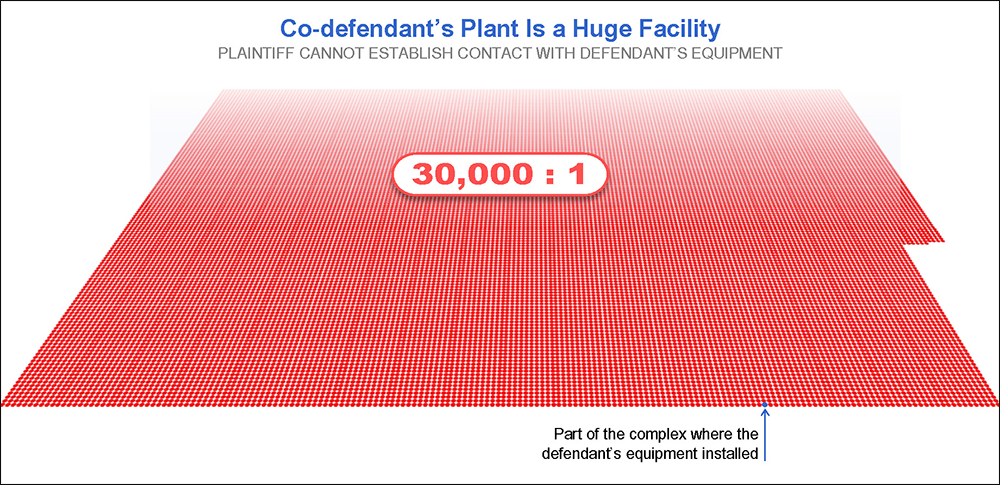
Manipulative charts are discussed as well, and some days I wish I could do what Kerri sometimes does: Use her opposing counsel’s visuals against them by pointing out the manipulations and flaws. As she says, “Often you can get a lot more mileage out of using your opponent’s slide than you can from excluding it.” Hence the importance of truly understanding y-axis manipulation on a bar chart.
Text: More and Less
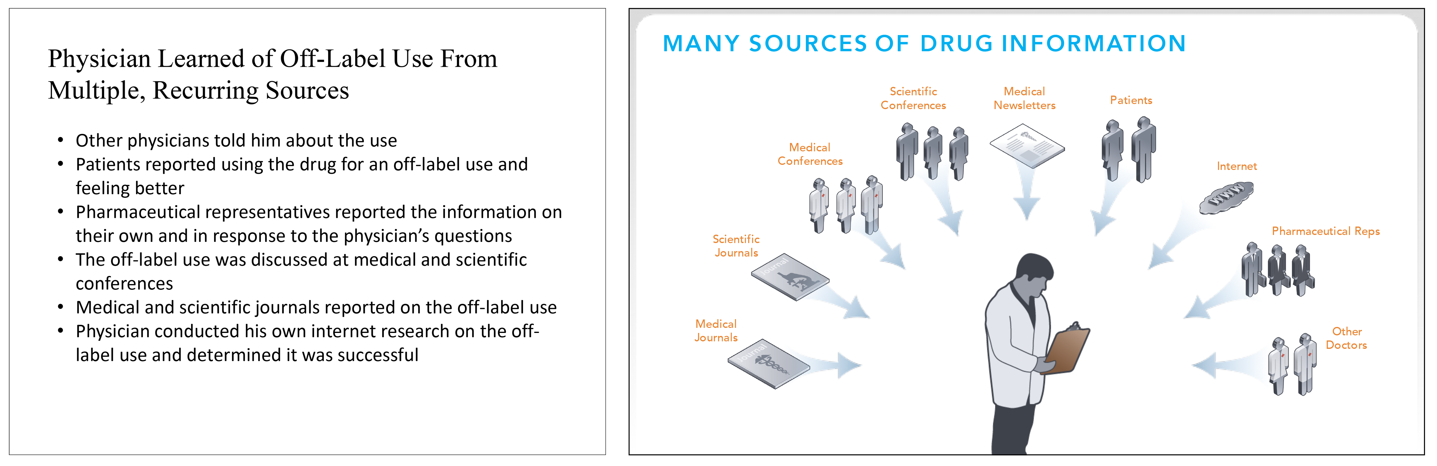
Another topic I see rarely covered in other presentation books is how exactly to harness the amount of content on a slide to your advantage. Sometimes filling a slide with text, such as a huge list of every person a defendant reported unethical behavior to, communicates a message better than a traditional “Presentation Zen” slide. But, of course, a mostly blank slide can do wonders as well like this great example:
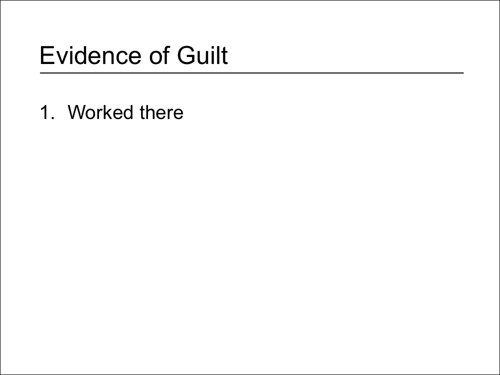 a
a
(That’s not the start of a build. That’s all there is to the slide.)
There’s Always More to Learn About Design
I learned a ton about trials and evidence, of course, but I also learned a design trick or two. Like if you have two photos of similar looking white dudes, flip one to face the opposite direction to help differentiate them. Going to use that one…
* * *
What’s Not to Like?
Did I have moments of disagreement? Sure: you should never embed fonts, but that’s nitpicking. The big problem with the book as it stands now is the price. Published by the American Bar Association, it has a cover price of $129.95, and it’s not discounted at all on Amazon. There are discounts for Bar members, and maybe it will drop in price on Amazon, but obviously that’s kind of a big barrier for someone who doesn’t charge $400/hr and who’s law firm won’t pick up the tab as an expense. But if you can pick up a copy, it’s a great addition to the presentation design canon.