 The majority of PowerPoint users probably have no idea that the program can work much better than what Microsoft gives you out of the box through the use of third-party add-ins. Corporate clients can have complex and custom functionality created for them including content libraries, charting macros, branding tools and much more. But the same people who create those corporate add-ins also create commercial tools for the average user. And unlike some plugins for other programs such as those by Adobe, PowerPoint add-ins tend to be relatively dirt cheap.
On the Presentation Podcast, we recently did a two parter, interviewing three of the industry’s leading PowerPoint developers, Jamie Garroch of YOUpresent, Gil Segal of ToolsToo and Steve Rindsberg of PPTools.
In those episodes, we barely talk about PowerPoint add-ins for the Mac because historically they have been nearly non-existent. But now, Jamie Garroch has developed his brand new YOUtools add-in to work and updated his to work on BOTH Mac and PC. In fact, it’s not even two separate files, but a single file that you can choose to install on either platform you choose. That alone kind of baffles me.
Jamie is continuing to refine the tools, but they are now on sale. And if you consider your time to be as valuable an asset as I do, the $29 price tag is a no-brainer. The Setup Guides tool can now do in seconds what once took 30 minutes or more.
Any catches? Yes, unfortunately there are a few items that are not currently supported on the Mac because Microsoft hasn’t opened up the required features on that platform. And that awesome Setup Guides tool is the major feature that will not appear in your toolbar when installed on a Mac. For now…
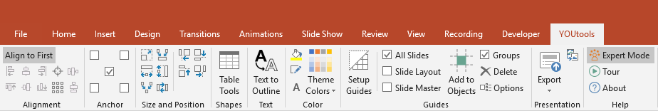
Below are the ribbons you’ll see on the PC…
and on the Mac…
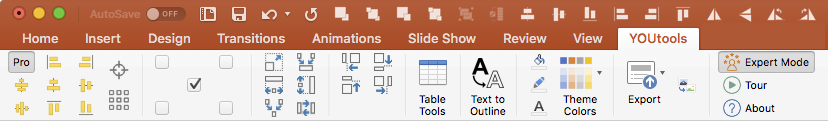
In addition to much more powerful alignment tools, you get Table tools which can help with sorting and conversion to text, Text to Outline which quickly turns live text into shapes and Export tools which includes a feature I have been wanting for years: Export to Webinar. This allows you to create a new, webinar-friendly version of your presentation that strips out and identifies items such as animation, transitions, video and more.
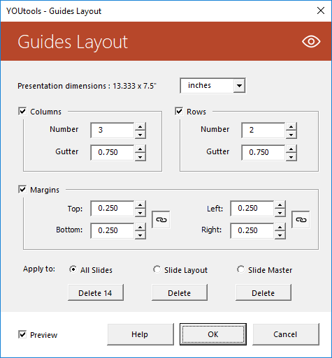
The two most powerful tools are undoubtedly (1) Setup Guides which allows you to set margins like a pro and add those margins as PowerPoint guides with absolute precision.
And (2) Theme Colors which gives you incredible granular control of creating and editing your color palette. This is going to be a lifesaver for anyone who regularly creates custom templates. I just used it yesterday and probably saved 10 minutes.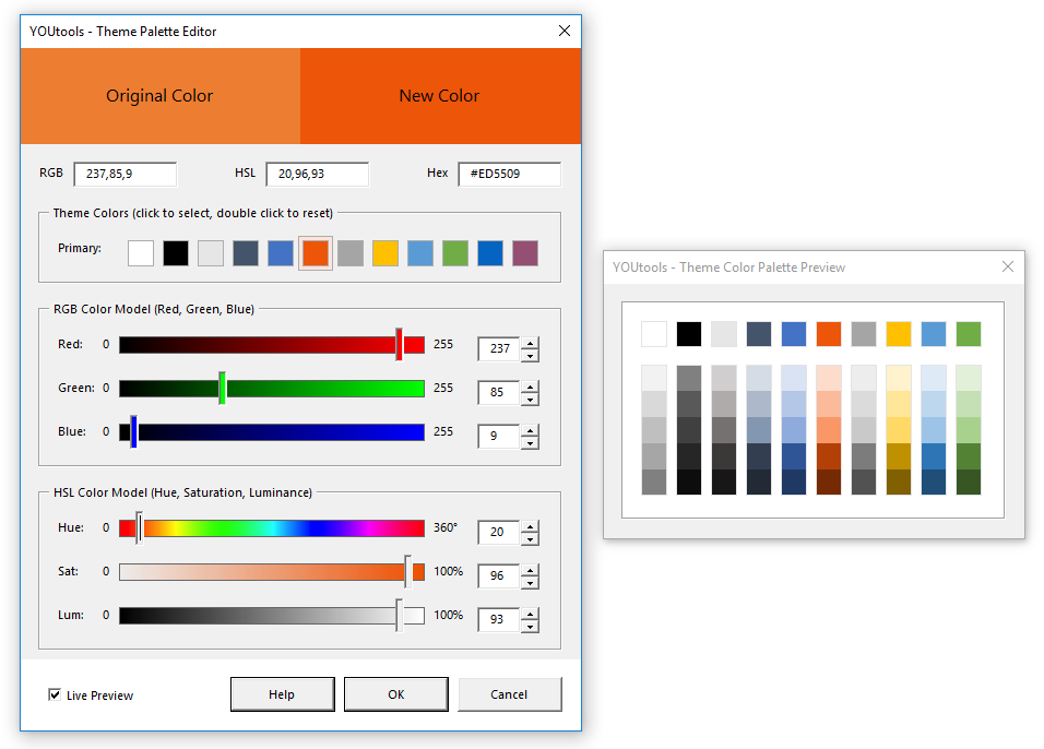
There’s more in the suite than even I’m mentioning here, and I have no doubt that the toolset will get more robust in time.
And as I said, at $29, it’s beyond a bargain.