Every NYT front page since 1852 from Josh Begley on Vimeo.
Category Archives: Information Design
Emoticons Were Invented in 1881
When was the first emoticon created? 1881, apparently, in Puck Magazine.
H/T to Brain Pickings and to 100 Diagrams That Changed the World, that is on its way to me from Amazon right now.
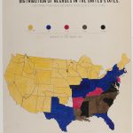
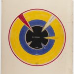
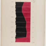
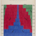
W. E. B. Du Bois’ Hand-Drawn Data Visualizations of African-American Life
Holy cow, look at these incredible hand-drawn data visualizations by W.E.B. Du Bois from 1900.
I admit that I knew and know very little about Du Bois and certainly had no idea that he created such visually unique and careful visualizations. The critic in me wants to say that some of these do not hold to modern best data viz practices, but damn, sometimes you want to get lost in a careful study of data and spend some time with beautiful meaningful graphic design. And that’s what you certainly do with these visualizations.
Check out all of them at Public Domain Review and as so often is the case, major h/t to Kottke.
NY Times Cabinet Confirmation Heat Map
I’m not always the biggest fan of heat maps, but I thought this one today from the NY Times on cabinet confirmations was particularly nice. And, of course, it’s interactive on their site.
Be Like Hans Rosling with PowerPoint Morph
Sadly, the world lost statistician, doctor and TED personality Hans Rosling yesterday. In honor of his endless enthusiasm for and influence on data and data visualization, I put together this little tutorial on how to approximate his Trendalyzer software to create animated bubble charts using PowerPoint’s morph transition.
If you haven’t seen Hans present, take a look at some of my favorites:
The Best Stats you’ve Never Seen • 200 Countries, 200 Years, 4 Minutes • Global Population Growth, Box by Box • Asia’s Rise: How and When
A Calendar Timeline Slide
We’re always looking to create timelines that are more interesting and more easily read. Recently a client kept talking about upcoming events that “were on the calendar,” and so we decided to ditch the normal linear timeline approach and just show an actual calendar.
I like how this literally visualizes the dates rather than putting them abstractly on a horizontal line.
De Blasio’s Awful NYC Budget Slides

Ugh. New York City Mayor Bill de Blasio presented the City’s new budget yesterday with a series of not ready for primetime slide-aments. Can’t seem to find the full deck, but here’s just one highlight.
Mini Metro Maps
Entirely impractical, but there’s something aesthetically beautiful about these simplified maps of various subway and train lines around the world.
h/t to Kotke
Alberto Cairo’s Data Exploration MOOC
Alberto Cairo, one of our top treasures when it comes to data visualization is teaching a completely free MOOC (Massive Open Online Course) with Heather Krause through the Knight Center.
Data Exploration and Storytelling: Finding Stories in Data with Exploratory Analysis and Visualization is a five-week course that runs from January 16 – February 26. Sign up for free right here.


