Category Archives: Design

Sharing the Stage with Your Slides (Sally Koering Zimney): The Presentation Podcast Episode #46

The Presentation Podcast


Episode #46, Sharing the Stage with Your Slides welcomes special guest Sally Koering Zimney, speech coach and host of the This Moved Me podcast.

How exactly should one interact or even acknowledge the slides behind you during a presentation?

Sally joins the crew to talk about the little and the big things to consider when sharing the stage with slides.


Subscribe on iTunes and check out the show notes for more info.

FacebooktwitterlinkedinFacebooktwitterlinkedin

Julie Terberg’s #SlideADayProject

The always awesome Julie Terberg is exploring design concepts in her #SlideADayProject over on Twitter. Tons of inspiration and examples of what good presentation design really is. Follow her if you know what’s good for you. Just a few examples below.

FacebooktwitterlinkedinFacebooktwitterlinkedin
Categories: Design, PowerPoint.

Visual Thinking by Emma Bannister

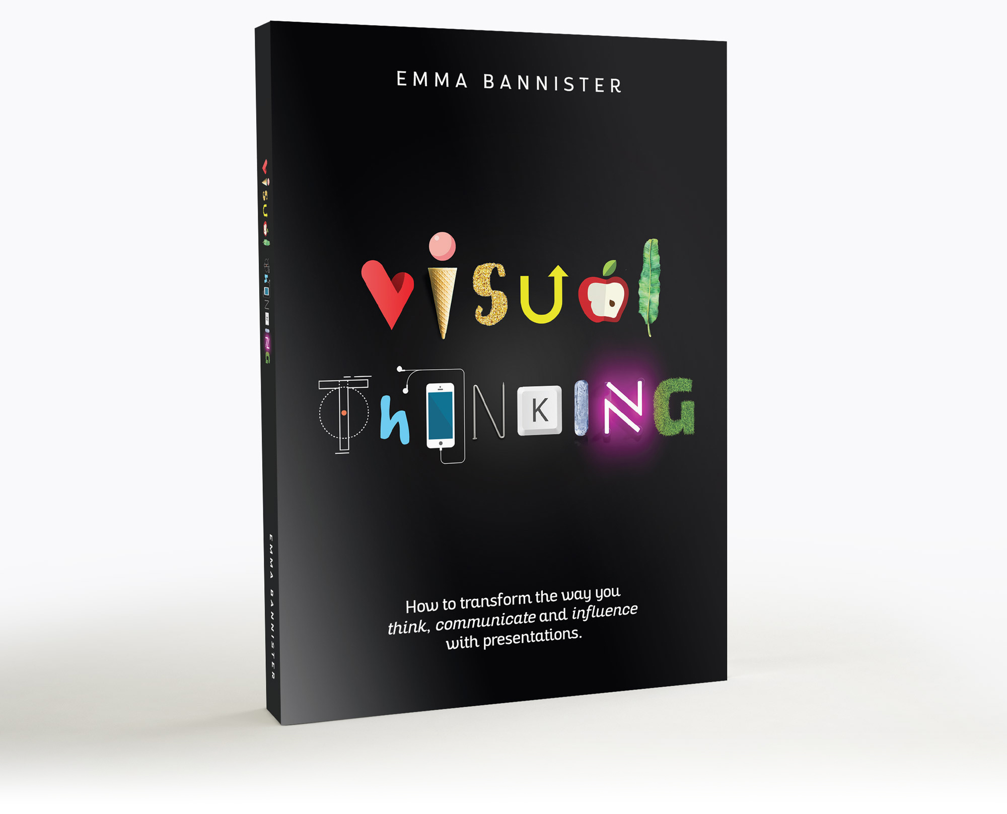
There are endless books on the scene covering presentation, but I can’t remember one quite as beautifully designed as Visual Thinking, the brand new addition from Emma Bannister.

Emma is the founder and CEO of Australia’s Presentation Studio, the largest presentation firm in APAC. And, full disclosure, she’s also just one of my favorite people in the world. So I forgive her insistence on incorrect spellings like “colour” and “practise”…

Visual Thinking is not a comprehensive manual on design, but rather a concisely assembled guidebook on what goes into a well-designed and effective presentation. The focus is largely on speaker-guided projected presentations that aim to persuade. Emma doesn’t quite assume that all presentations should fit a TED Talk model, but she does avoid addressing the challenges of many business presentation needs with statements like “It’s important to remember that you’re not putting together a report.” That’s one of the few disagreements I would have with the approach of the book, but then maybe we wouldn’t have the nicely focused and easily digestible one that we do. The focus of the book is squarely on producing tight messages and visual communications in a presentation context. 

There is some familiar territory covered and reinforced (Nancy’s Duarte’s Resonate sparkline story structure, John Medina), but ultimately Emma manages to avoid overwriting and endless references making points with just a sentence and graphic or two (such as with discussions of white space, color and contrast). Not only is she practicing with the book what she is preaching about presentation, but she’s taking Saint-Exupery to heart. And I don’t think any design book is complete without a reinforcement of his all-important advice, which is, of course, included here:

“Perfection is achieved not when there is nothing more to add, but when there is nothing left to take away.”
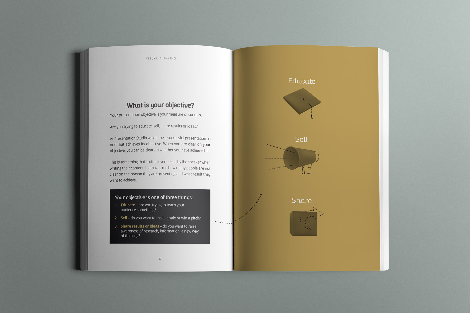
If there’s anyone on your Holiday Gift list that needs a little convincing or opening of the eyes on what effective visual presentation should be, this is the book to get. Easily finished in a single setting, it’s really a wonderful visual read.

And, of course, it’s an excellent calling card for the work that Emma’s studio does as well. If you’re not familiar with their work, just take a look at a bit of their portfolio.

Not available on Amazon just yet, but you can order direct here.

FacebooktwitterlinkedinFacebooktwitterlinkedin
Categories: Books, Design.

Conversation with Tom Howell & Mike Parkinson: The Presentation Podcast Episode #42

The Presentation Podcast


Episode #42, A Conversation with Tom Howell & Mike Parkinson is live!

Recorded at the Presentation Summit in Clearwater, FL, Troy and I chat with the two newest Microsoft MVPs, Tom Howell of Synapsis Creative in Australia and Mike Parkinson of Billion Dollar Graphics.

Don’t forget to give us a rating on iTunes if you like the Podcast and want to help spread the word!

Subscribe on iTunes and check out the show notes for more info.

FacebooktwitterlinkedinFacebooktwitterlinkedin
Categories: Design, PowerPoint.

PowerPoint for Digital Signage

One of the things I look forward to each year at the Presentation Summit is meeting new people, discovering what’s new in the world of presentation and learning how people are using PowerPoint in surprising ways. This year I saw some absolutely incredible video animations authored in PowerPoint, delivered a talk myself on how to create print documents with the software, and I got to meet Kurt Dupont from Belgium-based PresentationPoint.

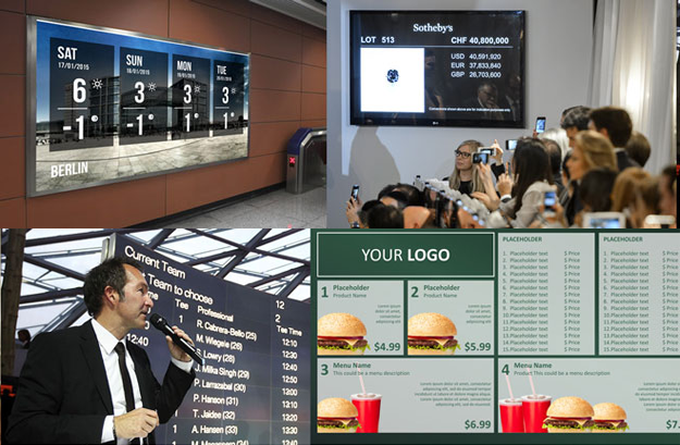
Kurt produces a few different custom software solutions for PowerPoint, but his flagship offering is DataPoint, an add-in that transforms PowerPoint into a powerful digital signage solution. And after a demo and learning more about DataPoint, I came to realize that I have probably been staring at PowerPoint out in the wild far more than I realized – and you have as well. When you walk into a hotel lobby, or visit a factory floor or pass by any screen offering you information, there’s a good chance that you’re looking at PowerPoint.

There are many competitors that offer various digital signage solutions, but most are closed systems with their own design tools. DataPoint lets you design and author all of your visuals right in PowerPoint. And then, all from a PowerPoint interface, you can connect live data feeds such as weather or financial information plus proprietary and local databases containing just about any information you can imagine. Need a real-time scroll of your daily conference schedule? Connect DataPoint to your Google Calendar. Need to see current inventory? Connect DataPoint to your in-house Sharepoint database. Just want a rotating list of clients? Drop them into an Excel file and connect.

My favorite example of DataPoint in action is Sotheby’s. Yeah, you know when you see those screens behind the auctioneer indicating current bids? That’s all PowerPoint/DataPoint pulling information real-time from connected databases.

And if you’re worried about the logistics of connecting a computer to the actual screen, many users have fixed that problem with the Intel Compute Stick attached discreetly to the back of the monitor. Again, something I didn’t know existed.

And maybe the best part is that the software is a one-time purchase at a ridiculously low cost. Seriously, when you look at their client base (NASA, Microsoft, Coca-Cola, NYSE, Boeing, etc.), I’m even more amazed.

My only disappointment is that I just don’t get called upon to create digital signage all that often by clients. But if you’re looking for a really slick solution yourself, definitely take a look!

FacebooktwitterlinkedinFacebooktwitterlinkedin
Categories: Design, PowerPoint.

Presentation Mistakes We Have Made: The Presentation Podcast Episode #40

The Presentation Podcast


Episode #40, Mistakes We Have Made is live!


We’re not perfect, not by a long shot. Join Sandy, Troy and I for a stumbling trip down memory lane as we discuss failures, mistakes, errors in judgment and flat out fiascos we’ve experienced in the the world of presentation.


Don’t forget to give us a rating on iTunes if you like the Podcast and want to help spread the word!

Subscribe on iTunes and check out the show notes for more info.

FacebooktwitterlinkedinFacebooktwitterlinkedin
Categories: Design, PowerPoint.

Logos Drawn From Memory

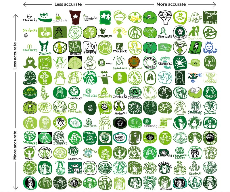
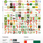
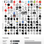
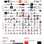
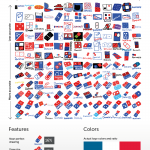
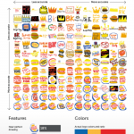
Signs.com asked people to draw famous logos from memory. I love everything about this including the X-Y axis visualization of the results. Check them all out here.


FacebooktwitterlinkedinFacebooktwitterlinkedin
Categories: Design, Visual Thinking.
visual training presentation