
The NY Times put together an interactive feature where users can input their own assumptions about various metrics of the Obama presidency and then learn how those assumptions stack up with reality.
Smart. Love it.

The NY Times put together an interactive feature where users can input their own assumptions about various metrics of the Obama presidency and then learn how those assumptions stack up with reality.
Smart. Love it.
Check out some of my presentation and PowerPoint predictions for the coming year in conversation with PresentationXpert.
![]()
Episode #21, Video and PowerPoint is live.
This week we’re talking about incorporating video into PowerPoint as well as using PowerPoint to create video. Troy probably knows more about this topic than anyone around, so take a listen to learn all the hidden video power you’ve got at your fingertips.
Don’t forget to give us a rating on iTunes if you like the Podcast and want to help spread the word!
Subscribe on iTunes and check out the show notes for more info.

Entirely impractical, but there’s something aesthetically beautiful about these simplified maps of various subway and train lines around the world.
h/t to Kotke

For the 4th year in a row, I’ve been awarded the Microsoft Most Valuable Professional award for PowerPoint. I’m honored to be one of just twelve in the U.S. (and a little over 30 worldwide) who work directly with the PowerPoint development team and serve as a bridge between Microsoft and their users. Learn more about the program here.

Alberto Cairo, one of our top treasures when it comes to data visualization is teaching a completely free MOOC (Massive Open Online Course) with Heather Krause through the Knight Center.
Data Exploration and Storytelling: Finding Stories in Data with Exploratory Analysis and Visualization is a five-week course that runs from January 16 – February 26. Sign up for free right here.
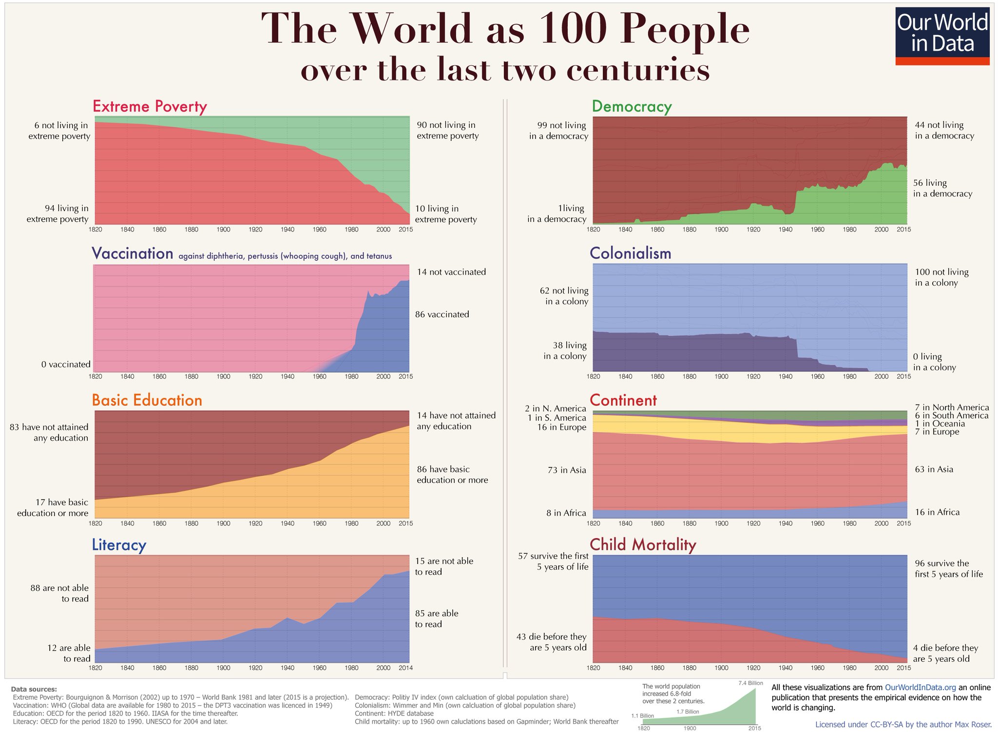
Nice 1-second area charts from OurWorldinData.org!
I love the use of panel charts (also called small multiples), but something did seem fishy about this NY Times chart showing that millennials seem less interested in democracy these days.

Fortunately, The Washington Post checked the Gray Lady in a great analysis which included this much more truthful chart that is still a panel chart.

![]()
Episode #19, Data Viz and Presentations is live.
This week we’re talking about special considerations for data viz in presentation, and we discuss Microsoft’s new “IVY” charting engine and where they’re going with data visualization.
Don’t forget to give us a rating on iTunes if you like the Podcast and want to help spread the word!
Subscribe on iTunes and check out the show notes for more info.

My good friend Jon Schwabish spends much of his time advocating for and teaching better data visualization and communications. And he’s rather amazing at it as one might expect of a Phd Economist who used to work for the Congressional Budget Office. But as someone who also presents quite often, he has now turned his attention to creating better presentations with his just released book aptly titled, Better Presentations. I highly recommend it also with Jon’s excellent PolicyViz blog, podcast and training services.