The 3 Legs of the Better Presentation Stool

I often receive calls from frustrated organizations that have had it with employees creating inconsistent and poorly designed presentations. Desperate to improve the professionalism of their presentations, they usually ask if I can either provide training or create a template that will solve all of these problems. In each case, I gently explain that any one strategy isn’t good enough on its own to solve their problems.

Dramatically improving the consistency and quality of an organization’s presentations involves a three-pronged approach. To use a tired metaphor, good organizational presentation is a three-legged stool:

  1. Smartly built template system, boilerplate collection and assets
  2. Customized training in both the use of the template and in general best presentation practices
  3. An internal presentation police force to enforce standards

Read the entire article at Presentation-Guru.com

FacebooktwitterlinkedinFacebooktwitterlinkedin
Categories: PowerPoint.

Stretching an Image Without Distortion

I have Photoshop open most of the day and yet, when I need to stretch a photo to fill the entire slide, I almost always use this hack directly in PowerPoint to make it happen without actually distorting the photo.

This also works great when converting a 4:3 presentation to 16:9.

Above is a quick video tutorial on how to do it!

Check out my YouTube Channel for this and more presentation hacks and tutorials.


FacebooktwitterlinkedinFacebooktwitterlinkedin
Categories: Design, Imagery, PowerPoint.

Wall Street Journal False Advertising: Data Viz Edition

Ugh. The deceptive proportional shape rears its head again, this time courtesy of a Wall Street Journal ad I saw this weekend in the print edition. And to be clear, this is an add FOR The Wall Street Journal.


Any average reader looking at the above ad would know instantly that The Wall Street Journal dwarfs its competitors when it comes to reaching senior executives. But any data visualization professional (or mathematician), would know instantly that the Journal is being incredibly dishonest with their graphic. Why? Because the Journal is using the diameter of the circles as comparison rather than the area. And when you use the diameter, you’re exaggerating and essentially telling a visual lie because of how readers process a chart like this.

If you read the detail lower in the ad, the claim is made that WSJ has twice the reach of The New York Times. But when readers see sized circles, they assume the area of the circles is the indicator of the amounts being compared. We can do a quick test to see that that assumption would be completely wrong.:

Overlaying The New York Times circle on top of the WSJ, we see that nearly four of the Times’s audiences would fit into that of the WSJ.


But wait, the WSJ only has twice the audience reach, right? Why is their circle so massive? Because…the WSJ wants to make their audience reach look much larger than it actually is. They want to use data visualization to fool readers into thinking they are even better than the Times in this metric than they actually are. And they do this by using the diameter of the circles.


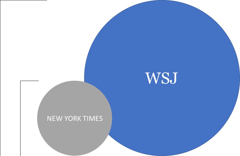
Yes, the diameter of the WSJ is 200% that of the Times. But that’s not how these things work.

A proper use of proportional shapes for this data would look something like this:


To make matters worse, Microsoft doesn’t do the world any favors by tacitly allowing this kind of data deception. I can’t speak for other data visualization software, but PowerPoint and Excel allow the user to choose either area or width when creating bubble charts–a type of proportional shape visualization.

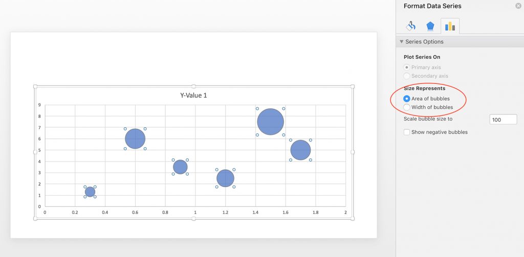
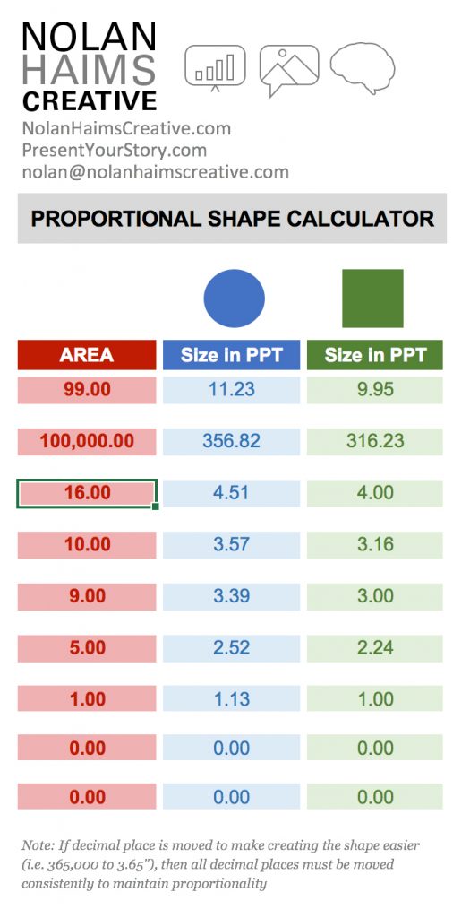
If you’re a user of Excel and PowerPoint, you can use bubble graphs to create proportional shapes for you and break apart the charts into shapes using some hacks, but a far easier way to create properly sized proportional shapes is to use my Proportional Shape Calculator tool–a simple Excel calculator you can download from the goodies page on this site. To gain access to that page, subscribe to PresentYourStory here and you’ll be sent a link with your confirmation email.

FacebooktwitterlinkedinFacebooktwitterlinkedin

John Maeda’s Design in Tech Report 2017

Interesting insights into state of design from John Maeda.

Download PDF from Slideshare as slideshow rasterizes horribly.

And interesting poor data design practices. Come on, percentage axes not labeled as “%”, missing axes, those sized circle things, legends…There is a point where removing too much from a data visualization causes is to take longer to read.


FacebooktwitterlinkedinFacebooktwitterlinkedin

Favorite Custom Shortcuts for PowerPoint

Yes, PowerPoint comes preloaded with hundreds of keyboard shortcuts for all types of functions, but naturally, it seems like some of the things you need to do most often can only be done by mousing and clicking. And Microsoft gives you no method for specifying custom keyboard shortcuts or changing the default ones.

Fortunately, Mac OS does allow you to set and change keyboard commands not just for Mac OS, but for almost any application running on your Mac via the System Preferences: Keyboard: App Shortcuts menu. Let me stress that this happens on the OS level outside of PowerPoint, so you need to go to your Mac preferences, not your PowerPoint ones. Your window should look like this, and you can add any installed app here and then start customizing keyboard commands. It’s fairly straightforward in that you have to physically type in the app menu command exactly as it appears (i.e. “Save as…”) and then you can specific what key combination you would like. Any changes here will override the app’s default shortcuts.

So, what are my favorite shortcuts? As you can see from the screengrab above, I have specified key commands for alignment and layer order. I am forever doing a finger dance of aligning, grouping, ungrouping, aligning objects and having to click the ribbon each time is a major time killer. So, picking up a cue from keyboard shortcuts in InDesign, I’ve set Shift-Command-Arrows to do the work for me. It’s a huge time saver.

What About the PC?

Well, up until yesterday, I didn’t think there was any easy way to assign similar shortcuts on the PC. But I just discovered OfficeOne’s Shortcut Manager for PowerPoint which via add-in allows you to do pretty much the exact same thing as Mac’s system preferences. Shortcut Manager is actually a bit easier to use in that you can search for and choose functions from category lists and even filter by assigned and unassigned along with specifying whether the commands should be active during slide design and/or slide show. It’s simple, but powerful. It’s also a bit steep at $39.95, but there is a 30-day trial. And honestly, if are hunting and pecking for the align right tool as often as I used to, it’s a bargain. Take it for a test drive!

FacebooktwitterlinkedinFacebooktwitterlinkedin
Categories: PowerPoint.

Typography and Typesetting in PowerPoint: The Presentation Podcast Episode #23

The Presentation Podcast

Episode #25, What is the Page Size of 16×9? is live.

This week we’re getting very inside baseball and demystifying page size and aspect ratio in PowerPoint. Why 13.333″ an important number and why would you want to add an extra 1/8″ of an inch on each side of your PowerPoint slide? Listen to Episode #25 and find out!

Don’t forget to give us a rating on iTunes if you like the Podcast and want to help spread the word!

Subscribe on iTunes and check out the show notes for more info.

FacebooktwitterlinkedinFacebooktwitterlinkedin
Categories: PowerPoint.
visual training presentation