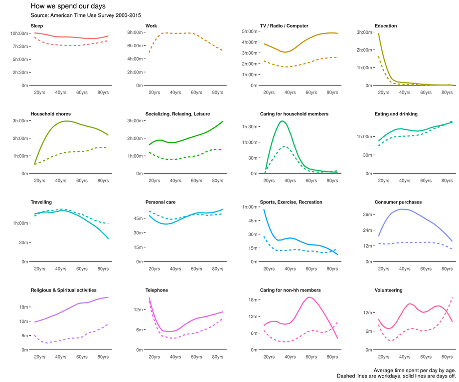
Courtesy of Data Is Beautiful.


Storytelling with Data has a nice updated post on the charts everybody loves to hate (me included) with some good do’s and don’ts.
And if you aren’t subscribed to and don’t know about Storytelling with Data and Cole Nussbaumer, um…you should.

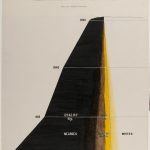
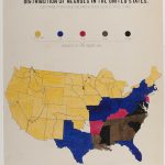
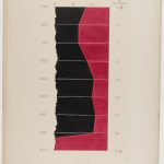
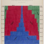
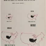
Holy cow, look at these incredible hand-drawn data visualizations by W.E.B. Du Bois from 1900.
I admit that I knew and know very little about Du Bois and certainly had no idea that he created such visually unique and careful visualizations. The critic in me wants to say that some of these do not hold to modern best data viz practices, but damn, sometimes you want to get lost in a careful study of data and spend some time with beautiful meaningful graphic design. And that’s what you certainly do with these visualizations.
Check out all of them at Public Domain Review and as so often is the case, major h/t to Kottke.


I’m not always the biggest fan of heat maps, but I thought this one today from the NY Times on cabinet confirmations was particularly nice. And, of course, it’s interactive on their site.
Sadly, the world lost statistician, doctor and TED personality Hans Rosling yesterday. In honor of his endless enthusiasm for and influence on data and data visualization, I put together this little tutorial on how to approximate his Trendalyzer software to create animated bubble charts using PowerPoint’s morph transition.
If you haven’t seen Hans present, take a look at some of my favorites:
The Best Stats you’ve Never Seen • 200 Countries, 200 Years, 4 Minutes • Global Population Growth, Box by Box • Asia’s Rise: How and When

The NY Times put together an interactive feature where users can input their own assumptions about various metrics of the Obama presidency and then learn how those assumptions stack up with reality.
Smart. Love it.

Alberto Cairo, one of our top treasures when it comes to data visualization is teaching a completely free MOOC (Massive Open Online Course) with Heather Krause through the Knight Center.
Data Exploration and Storytelling: Finding Stories in Data with Exploratory Analysis and Visualization is a five-week course that runs from January 16 – February 26. Sign up for free right here.
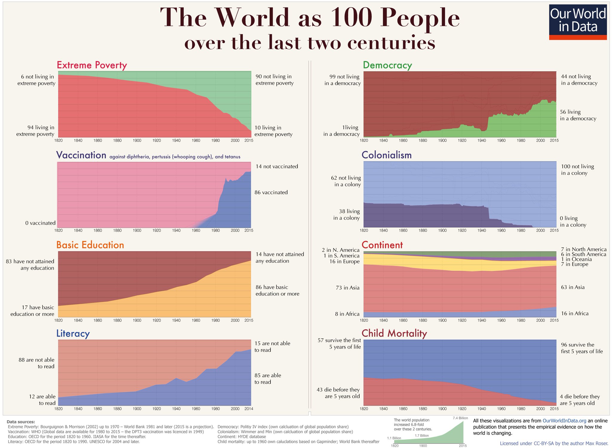
Nice 1-second area charts from OurWorldinData.org!
I love the use of panel charts (also called small multiples), but something did seem fishy about this NY Times chart showing that millennials seem less interested in democracy these days.

Fortunately, The Washington Post checked the Gray Lady in a great analysis which included this much more truthful chart that is still a panel chart.

![]()
Episode #19, Data Viz and Presentations is live.
This week we’re talking about special considerations for data viz in presentation, and we discuss Microsoft’s new “IVY” charting engine and where they’re going with data visualization.
Don’t forget to give us a rating on iTunes if you like the Podcast and want to help spread the word!
Subscribe on iTunes and check out the show notes for more info.