Fellow PowerPoint MVP Glenna Shaw has a nice article up on Microsoft on using Excel to visualize time including creating accurate timelines and clock charts. Take a look!

Fellow PowerPoint MVP Glenna Shaw has a nice article up on Microsoft on using Excel to visualize time including creating accurate timelines and clock charts. Take a look!
Always read the footnotes!
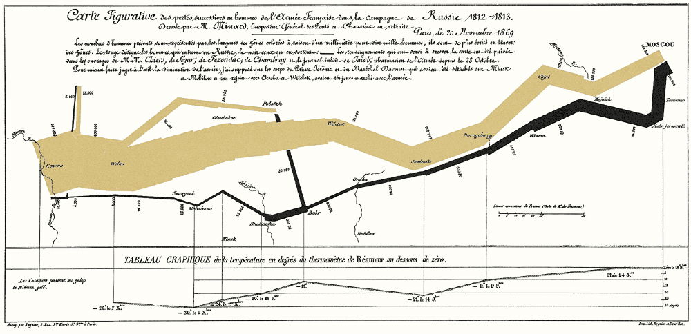
Thanks to Alberto Cairo for a footnote in The Truthful Art pointing me to this small paper by Michael Friendly on Charles Joseph Minard and his famous graphic of Napoleon’s disastrous 1812 Russian march.
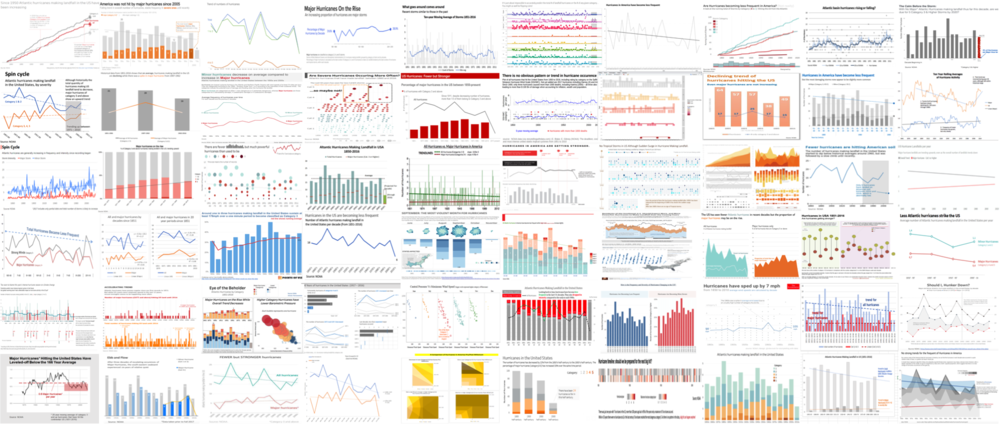
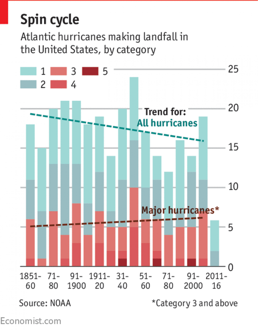
Via Storytelling with Data, take a look into 60 makeovers to this original chart from The Economist:
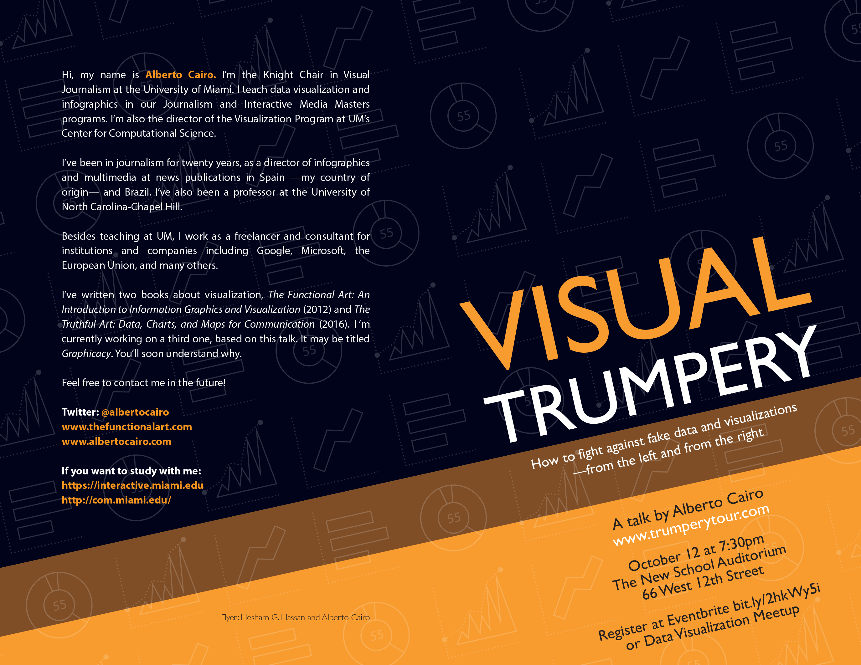
I’m really excited to be attending “Visual Trumpery,” a talk by Alberto Cairo hosted by the NYC Data Visualization Meetup group.
If you’re not a member of the Meetup group, you can register on Eventbrite here.
Spread the word!
There’s a new podcast in town all about data and technology and how it shapes our world. And guess what? I’m the inaugural guest for episode 1.
Data Talks is hosted by Ashutosh Nandeshwar, an analytics guru, PhD and data specialist.
Take a listen as we talk about visual storytelling and make sure to subscribe and rate it.
And if you aren’t a subscriber to The Presentation Podcast, um…why aren’t you a subscriber to to The Presentation Podcast?
I love Bullet Graphs and loved this guest post by Billy Dean over at Storytelling with Data.
In my training sessions, I teach people how to turn a dreaded clustered column chart into a bullet graph with just a few clicks. If you haven’t used them, you should be…
Ugh. The deceptive proportional shape rears its head again, this time courtesy of a Wall Street Journal ad I saw this weekend in the print edition. And to be clear, this is an add FOR The Wall Street Journal.
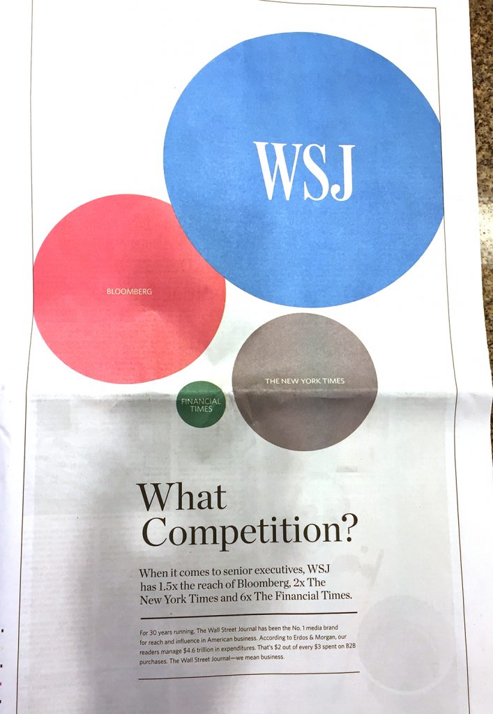
Any average reader looking at the above ad would know instantly that The Wall Street Journal dwarfs its competitors when it comes to reaching senior executives. But any data visualization professional (or mathematician), would know instantly that the Journal is being incredibly dishonest with their graphic. Why? Because the Journal is using the diameter of the circles as comparison rather than the area. And when you use the diameter, you’re exaggerating and essentially telling a visual lie because of how readers process a chart like this.
If you read the detail lower in the ad, the claim is made that WSJ has twice the reach of The New York Times. But when readers see sized circles, they assume the area of the circles is the indicator of the amounts being compared. We can do a quick test to see that that assumption would be completely wrong.:
Overlaying The New York Times circle on top of the WSJ, we see that nearly four of the Times’s audiences would fit into that of the WSJ.

But wait, the WSJ only has twice the audience reach, right? Why is their circle so massive? Because…the WSJ wants to make their audience reach look much larger than it actually is. They want to use data visualization to fool readers into thinking they are even better than the Times in this metric than they actually are. And they do this by using the diameter of the circles.
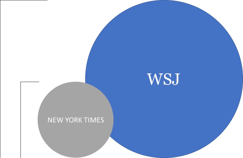
Yes, the diameter of the WSJ is 200% that of the Times. But that’s not how these things work.
A proper use of proportional shapes for this data would look something like this:

To make matters worse, Microsoft doesn’t do the world any favors by tacitly allowing this kind of data deception. I can’t speak for other data visualization software, but PowerPoint and Excel allow the user to choose either area or width when creating bubble charts–a type of proportional shape visualization.
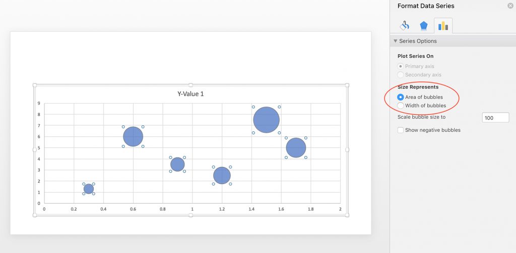
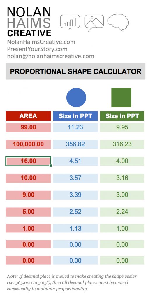
If you’re a user of Excel and PowerPoint, you can use bubble graphs to create proportional shapes for you and break apart the charts into shapes using some hacks, but a far easier way to create properly sized proportional shapes is to use my Proportional Shape Calculator tool–a simple Excel calculator you can download from the goodies page on this site. To gain access to that page, subscribe to PresentYourStory here and you’ll be sent a link with your confirmation email.
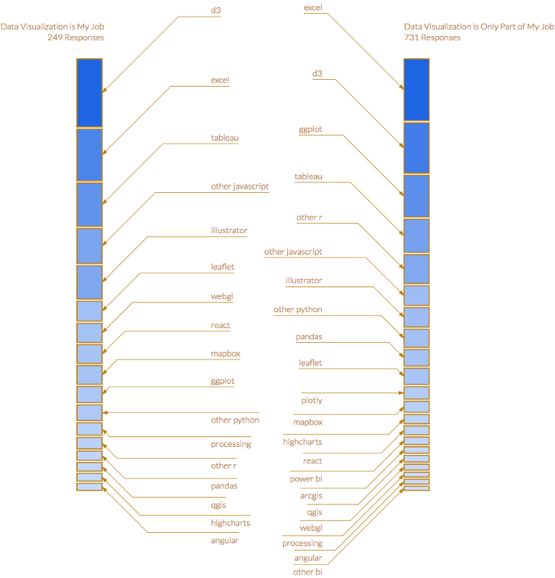
Elijah Meeks (Data Visualization Engineer at Netflix) put together a survey on data visualization, but what I really liked was his above solution for those impossibly crowded stacked bar charts. This may be an output of some data software I don’t use, but you could certainly do this in Excel with a little extra manual work.

Interesting insights into state of design from John Maeda.
Download PDF from Slideshare as slideshow rasterizes horribly.
And interesting poor data design practices. Come on, percentage axes not labeled as “%”, missing axes, those sized circle things, legends…There is a point where removing too much from a data visualization causes is to take longer to read.