Episode #57, Do You Like PowerPoint Sections? is up and live!
Yes: Sandy, Troy and I fill a whole episode on this one subtle, but incredibly useful feature.
Subscribe on iTunes and check out the show notes for more info.
Episode #57, Do You Like PowerPoint Sections? is up and live!
Yes: Sandy, Troy and I fill a whole episode on this one subtle, but incredibly useful feature.
Subscribe on iTunes and check out the show notes for more info.
Episode #54, A Conversation with PPT Add-in Developers (Part 2) is up and live!
Join Sandy, Troy and I along with three of the biggest names in PowerPoint development: Gil Segal, Jamie Garroch and Steve Rindsberg.
Subscribe on iTunes and check out the show notes for more info.
Episode #53, Using Color in PowerPoint is live!
This week we’re getting granular on using (and not mis-using) the color palette. Lots of really good links in the show notes too!
Subscribe on iTunes and check out the show notes for more info.
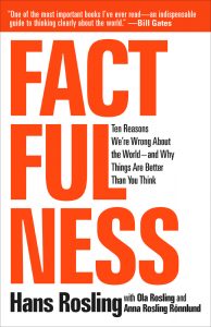
 Factfulness by Hans Rosling is significant attention as well it should be. Of course, Bill Gates saying it is “one of the most important books” he’s ever read doesn’t hurt.
Like any reader, I imagine, I had my eyes opened continually about misconceptions about the world–which is the intent of the book. But, I’ll always remember Hans Rosling not only for what he said, but how he said it. His TED Talks are famous for his energy, but also for the demos of his Gapminder software that animates bubble charts. Rosling was able to visualize data in such an accessible way, and I wanted to point out two of my favorite examples of how he implemented visual storytelling in Factfulness.
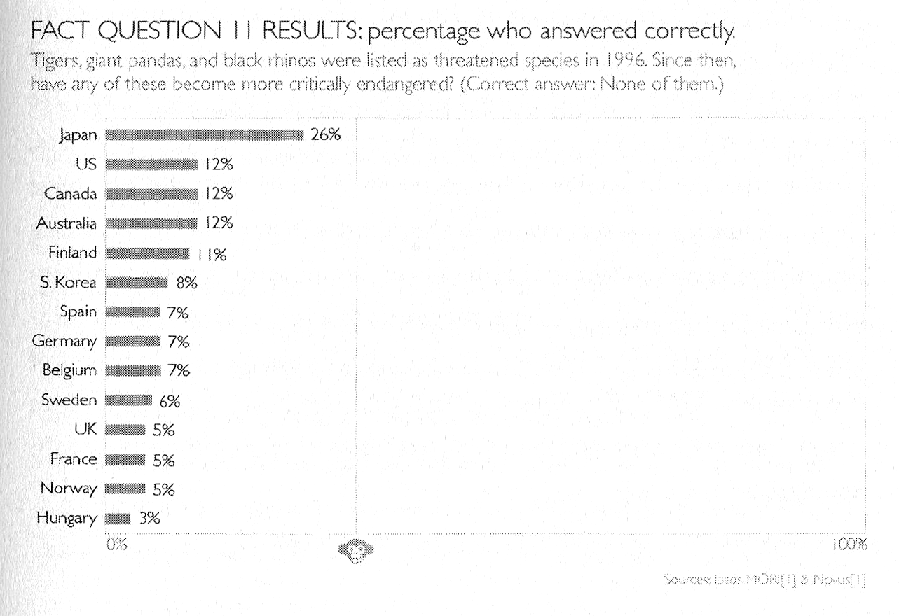
The book is premised on the survey results to a series of questions that Rolling asked audiences all over the world. Predictably, no matter what their education or background, people fundamentally have misperceptions about the world and facts. Each question only has three possible answers, and he makes the point over and over that even a chimpanzee answering the quiz will get on average 33% correct answers. But as we see, even the most educated audiences often score lower than a random guess because of bias. And so, Rosling will add in on the x-axis a “Chimp Point” showing were random correct responses should lie. Here’s an example.

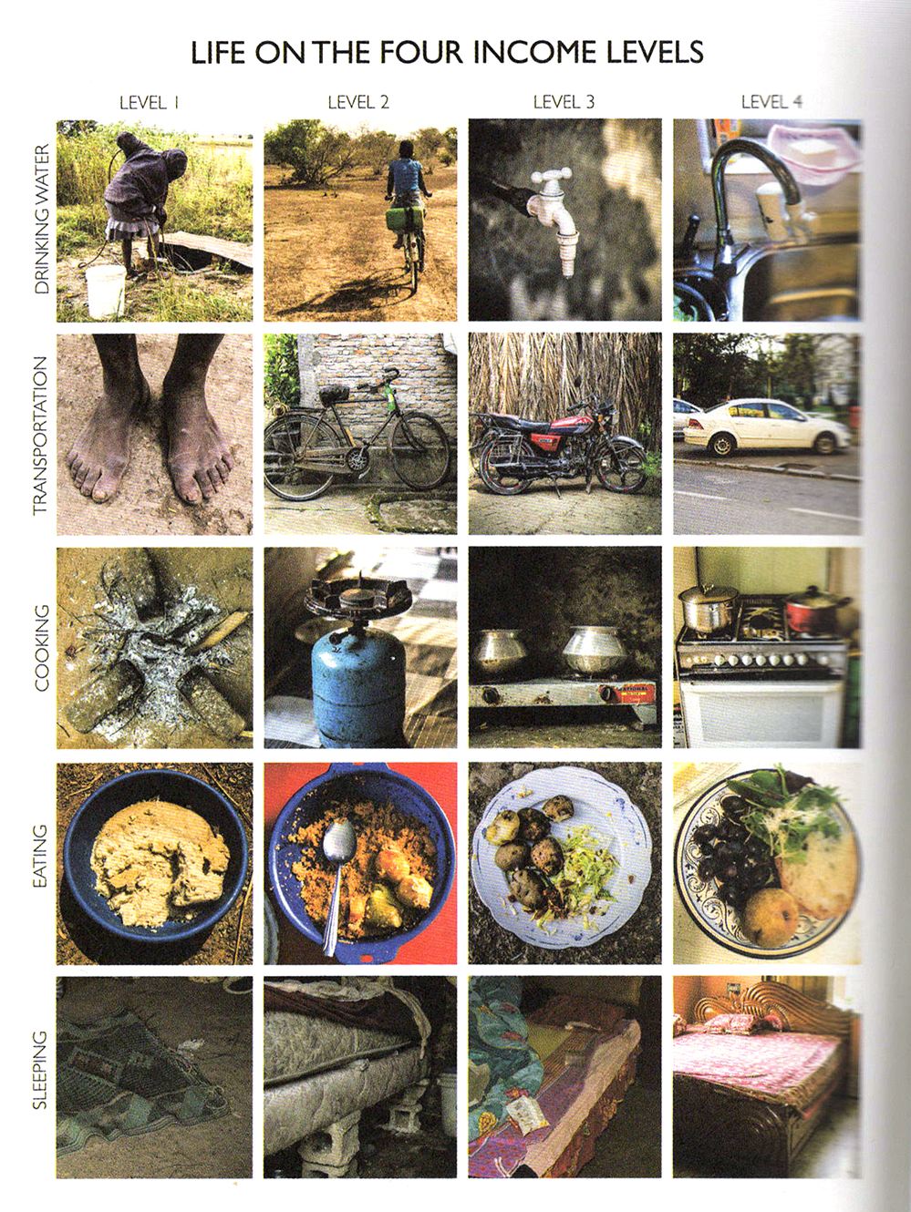
Much of the book revolves around the four income levels as defined by the World Bank which breaks down essentially as:
Level 1: $1/day
Level 2: $4/day
Level 3: $16/day
Level 4: $64/day
You could chart or describe with words these four levels in a million different ways, but Rosling breaks it down to the simplest explanation with pictures of what it means at different levels to
sleep or eat or brush your teeth. Here’s a grid showing just what it means…

It’s a good and fast read, and I definitely recommend it.
And if you want to make animated bubble charts a la Rosling, you can do so in PowerPoint with this hack.
Episode #51, PowerPoint Add-ins We Like is live.
Stay tuned for bonus episodes with developer interviews…
Subscribe on iTunes and check out the show notes for more info.
Episode #50 is live: Live from the 2018 Microsoft MVP Summit. Find out what happens when a dozen Microsoft PowerPoint MVPs gather late at night with drinks in hand. Sorry, no super secret information revealed, but still a lot of fun and presentation topics galore.
Subscribe on iTunes and check out the show notes for more info.
Episode #49 is live: What Makes Presentation Slides Beautiful with special guest Mitch Grasso of the brand new presentation software, Beatiful.ai is live.
Subscribe on iTunes and check out the show notes for more info.
Episode #48, Giving and Getting Feedback is live.
Subscribe on iTunes and check out the show notes for more info.
McKinsey has put up their branding guidelines including some glimpses of their, typography, colors and PowerPoint templates including custom plugins.
It seems to be more of a marketing overview for marketing and promotional purposes, but still interesting to glean a little info from.
H/T to SlideMagic