Category Archives: Design

How to Use PowerPoint Chart Templates to Speed Up Formatting Your Data

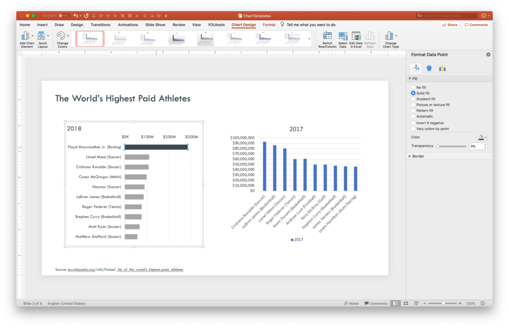
PowerPoint’s Format Painter can save you endless hours with shapes and text boxes, but it doesn’t work on charts. There is, however, a method to save and paste design formatting from one chart to another. So, let’s dive into the mysterious world of Chart Templates and .crtx files.

We’ll start with data sets for the highest paid athletes in 2018 and 2017 and a default chart style (click the images below for a closer look)…

Continue reading the entire article over at CreativePro.com.

And don’t forget, I’ll be speaking at CreativePro’s CreativeProWeek Click Presentation Conference in June in Seattle! (Discounted registration available until April 15!)


FacebooktwitterlinkedinFacebooktwitterlinkedin

The Data Visualization Sketchbook

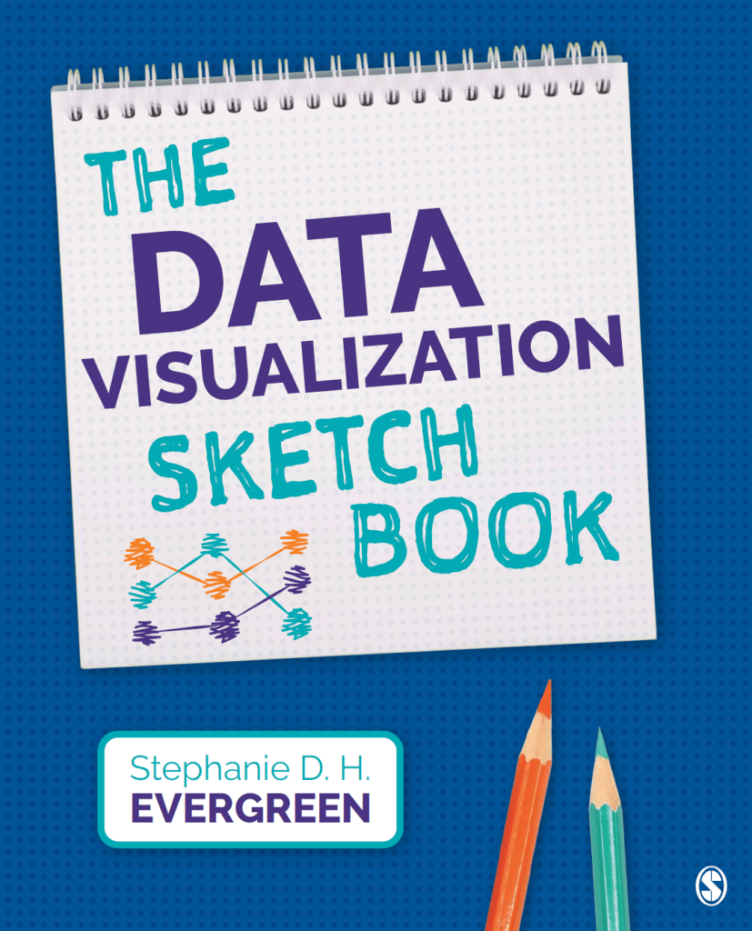
Stephanie Evergreen will soon be out with another book for the data visualization community (to coincide with the second edition of her phenomenal first book Effective Data Visualization). This one is called The Data Visualization Sketchbook, and in it Stephanie gives readers multiple templates for use in assembling data reports, handouts, dashboards, presentations and more.

The templates and overall approach are a nice reminder that diving into Tableau or Word or PowerPoint is not always the best or most efficient course of action. Sometimes getting pencil and paper out helps organize your data and information and simplify your message.

Below are a couple of Stephanie’s templates I used to prep for an upcoming data report project.

Take a look and also take a look at Stephanie’s site for tons of great info on visualizing data.


FacebooktwitterlinkedinFacebooktwitterlinkedin

3D Content Guidelines for Microsoft

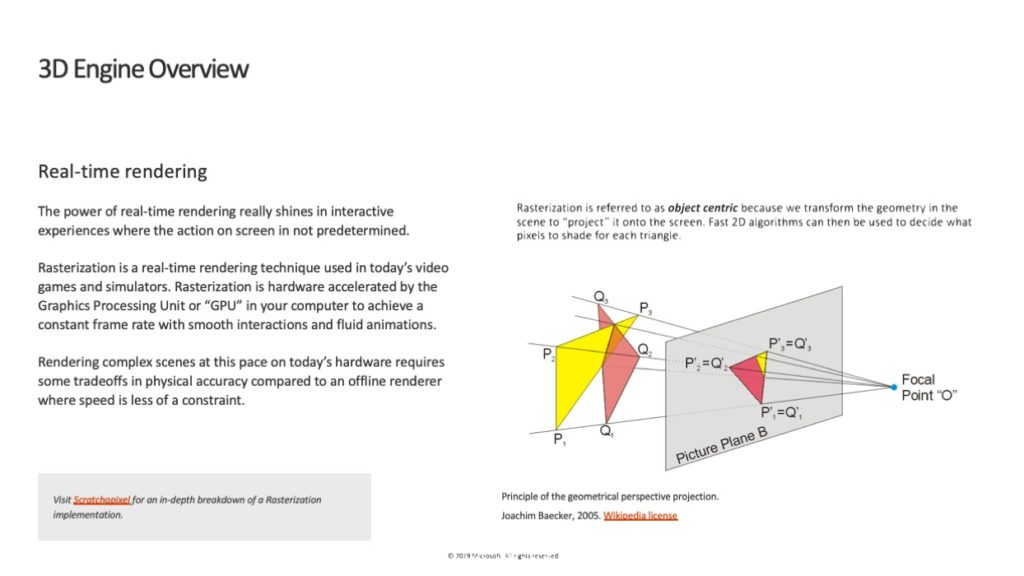
The addition of 3D object support for PowerPoint last year was a huge leap forward by Microsoft. Naturally, first generation features always come with limitations, confusions and questions by users. That was definitely the case with 3D, but Microsoft has continued to improve the feature (animations!) and is committed to its future.

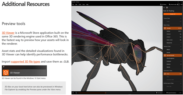
Since 3D is such a dense and multi-faceted thing, Microsoft just released content guidelines for users and creators of 3D objects. A lot of what’s in this new documentation can get pretty technical (“Joint Count Mapped to Vertices Maximum on an i5 vs i7…”), but it’s going be vital to a certain crowd trying to figure out why the 3D model of their new engine isn’t rendering correctly when the CEO is introducing it on stage.

You can read it all here and download a PDF or, of course, a PowerPoint version of the document.

FacebooktwitterlinkedinFacebooktwitterlinkedin
Categories: Design, PowerPoint.

CreativeProWeek: Click – A Conference for Presentation Designers

CreativeProWeek is the country’s premiere “how-to” conference for design professionals. Their unique format divides the week into various subject areas including InDesign, Photoshop, Illustrator and more. And last year for the first time, the conference added two days focused on presentation design – that all-too-important topic that doesn’t always get much love from the more traditional worlds of print and graphic design.

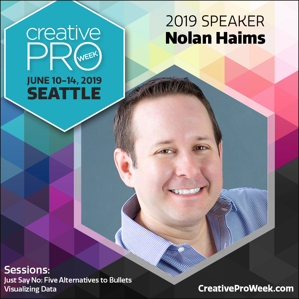
This year, CreativeProWeek is again offering two days of intensive focus on presentation design in their conference within a conference called Click. And I will be speaking in Seattle the week of June 10th along with some other industry pros including Julie Terberg and Richard Goring.

I will be giving sessions on Alternatives to Bullet Points and Visualizing Data for Presentation.

If you are professional presentation designer or if you’re a graphic designer who often gets frustrated when called upon to design presentations, this is the conference for you. Come for just the Clickportion or come for more. Personally, I’ll be there all week eagerly soaking up the InDesign and Photoshop sessions. There’s always more to learn!

And if you are thinking of going, definitely register by April 15th when the early bird discount expires.

Take a look at the full conference agenda, list of expert speakers, and register now at CreativeProWeek.com.

Please don’t hesitate to reach out with any questions on this (or anything else, of course) if you have them!

FacebooktwitterlinkedinFacebooktwitterlinkedin

Presenting in a Non-Profit World (with Andy Goodman): The Presentation Podcast Episode #73

The Presentation Podcast


Episode #73, Presenting in a Non-Profit World (with Andy Goodman) is up! This week we ditch the corporate world to talk about presentation in the world of cause-based organizations. Andy Goodman of The Goodman Center joins us to talk about his career teaching storytelling and presentation to non-profits, NGO’s and foundations. And we dive into his seminal 2006 book, Why Bad Presentations Happen to Good Causes which you can download for free here.

Take a listen!

Subscribe on iTunes and check out the show notes for more info.

FacebooktwitterlinkedinFacebooktwitterlinkedin
visual training presentation