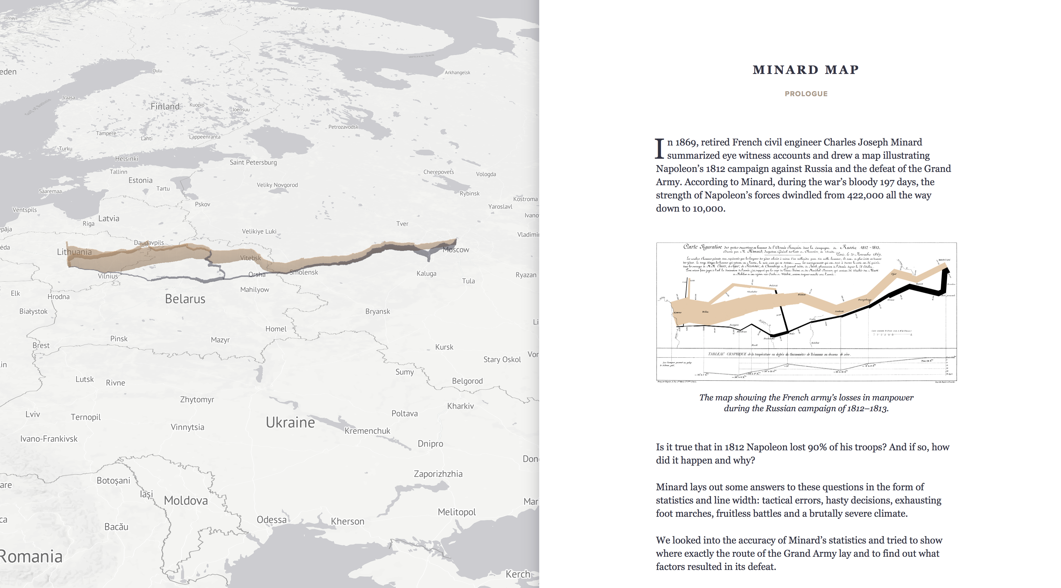
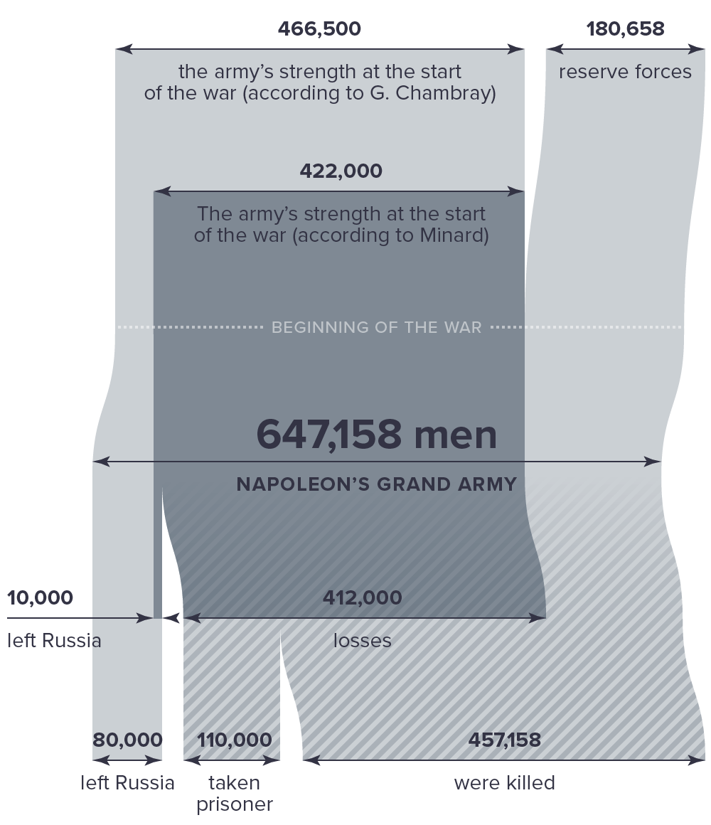
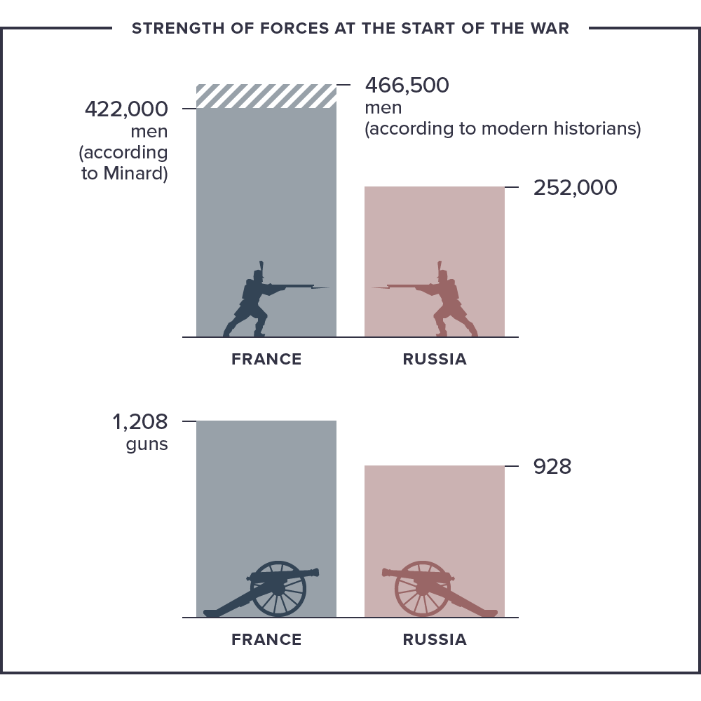
Looks like TASS has taken a break from manipulating US politics to create a really amazing interactive analysis of Minard’s Napoleon March to Moscow graphic.
Incredibly well-done, researched and informative. Also check out this paper on the Minard graphic I recently found.


In addition to the six or seven types of data that Minard includes, I have wondered how the graphic would look if we were to use a gradient to show the ‘speed’ of the army along the path (through ink density, for example). Let me know if anyone would like to try this.