Interesting insights into state of design from John Maeda.
Download PDF from Slideshare as slideshow rasterizes horribly.
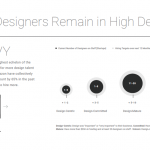
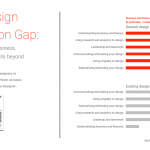
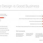
And interesting poor data design practices. Come on, percentage axes not labeled as “%”, missing axes, those sized circle things, legends…There is a point where removing too much from a data visualization causes is to take longer to read.