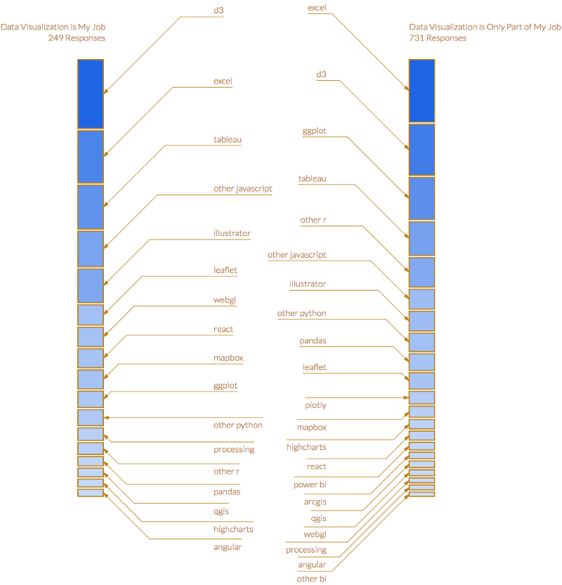
Elijah Meeks (Data Visualization Engineer at Netflix) put together a survey on data visualization, but what I really liked was his above solution for those impossibly crowded stacked bar charts. This may be an output of some data software I don’t use, but you could certainly do this in Excel with a little extra manual work.
Learning to Love Stacked Bar Charts Again
Categories: Information Design, Showing Data.
