A visual will almost always trump text, but sometimes text functions as a visual itself. The other day a client who offers a SaaS product called asking if there was a better way to show feature options across various versions than his current tabled list. I can’t show his list, but it was very similar to this from Quicken:
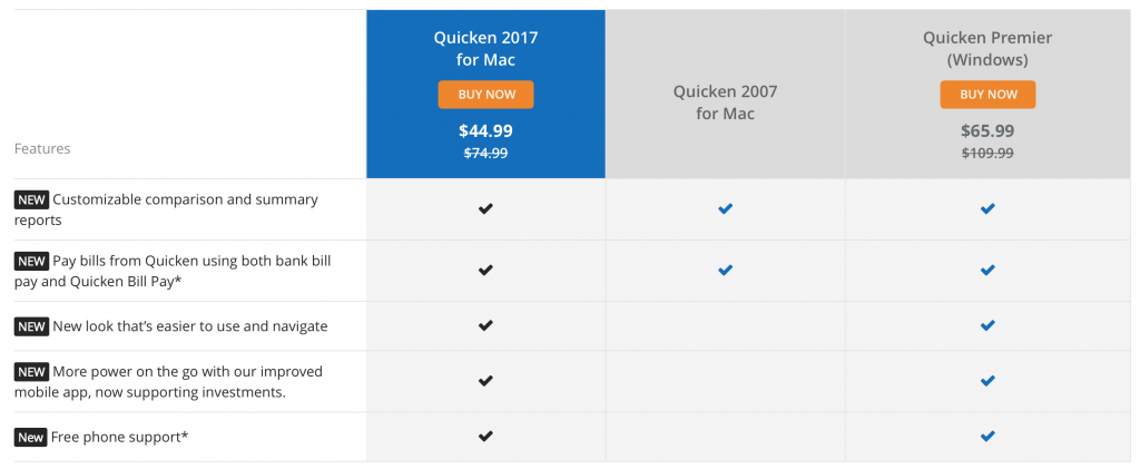
We’ve all seen things like this and the reason is that things like this work quite well in quickly comparing and contrasting in order to make a decision. This is a time when simple checkmarks or missing checkmarks serves as a highly informative visual story.
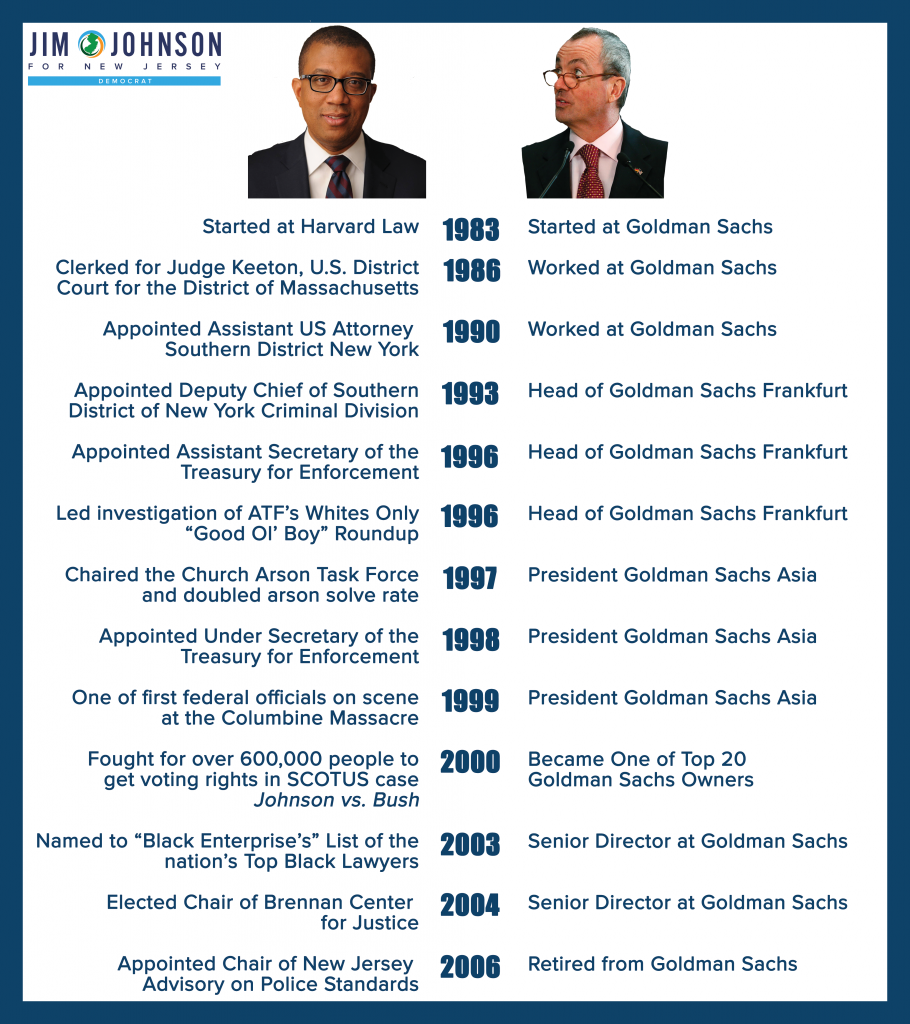
Today I received an email from Jim Johnson, a New Jersey gubernatorial candidate contrasting himself with his primary challenger. And I loved it. It was nearly all text, but the repetition of Murphy’s limited diversity of experience was easily readable and served as a glanceable visual with a big story.
Sometimes a table is simply the best choice. And sometimes text does communicate visually.